Showing posts with label treasuries. Show all posts

Wednesday, April 19, 2023

Wage Inflation Pressure

The following chart shows the natural log of U.S. wage and salary disbursements. When using natural logs, constant exponential growth is seen as a straight line.


The Fed does not need to deflate wages back into the long-term channel in green, but rather to return to the slope of that channel. What's done is done. Deflation to undo the high inflation is definitely not the goal.

Some progress is being made. We've noved from the steep slope of the red line to the more moderate slope of the yellow line.

I'm convinced that they can achieve their goal, one way or another. But at what cost? I can be a bit cynical, but there's a high risk here that we're still in the early stages of a no-win situation.

How high will the unemployment rate need to rise to get us back to the healthier wage inflation trend? I have no idea, but I can say with 100% certainty that 100% unemployment would do it. Can't have any wage and salary disbursements if nobody is working.

The bulk of my net worth sits in inflation-protected I-Bonds and TIPS. As of about a year ago, my IRA sits entirely in bonds without inflation protection (TLT). And here's where I sit until I see a reason to take on more risk. Near record unemployment expected to rise, falling house prices, and high interest rates are not things that make me excited about taking on riskier investments.

Not investment advice.

Tuesday, December 13, 2022

Converting Paper Savings Bonds

Dear Customer,

This is a system generated email to communicate we received your Savings Bonds/Treasury Marketable Securities materials.

Cases are worked in the order they are received in our office. Your request is important to us and will receive attention as soon as possible. Please allow up to 13 weeks for review and processing. If we require additional information, we will contact you. Thank you for your patience.


Up to 13 weeks? Ouch. The wheels on the governmental bureaucratic bus go round and round, round and round, round and round.

Thursday, November 10, 2022

Gimme Shelter

The following chart shows the natural log of the CPI for shelter. When using natural logs, constant exponential growth is seen as a straight line. I have added long-term trend lines in red.


With lofty housing prices and lofty mortgage rates, it seems very unlikely that we're going to make it back to the top of the trend channel anytime soon. Which, if you think about it, is kind of odd. I could swear that the Fed really wanted that. Just not all at once, apparently. Too bad.

If I were a gambling man, I would wager that there is more risk leaving the channel to the downside than to the upside. And maybe I am a gambling man, because I continue to hold TLT. Very encouraged by today's CPI report. One battle doesn't win the war though, of course.

Saturday, October 29, 2022

Massive Economic Uncertainty Continues

So many consumer surveys, but none of them ask the key questions for the next year:
- How much did you accumulate in savings during the pandemic?
- How much do you have left?
- How much of that do you intend to spend?
Without the answers, forecast margins of error are *massive.*


Twitter: Ian Shepherdson

Great questions. Too bad the Fed Chairman can't see the answers.

Monday, October 24, 2022

Jerome “The Earl” Powell

The following chart shows the unemployment rate minus the 12-month percentage change in the median CPI. I have added long-term trend lines in red and a short-term arrow in green.


I looked at Earl and his eyes was wide
His lip was curled, and his leg was fried
And his hand was froze to the wheel
Like a tongue to a sled in the middle of a blizzard

I says, Earl, "I'm not the type to complain
But the time has come for me to explain
That if you don't apply some brake real soon
They're gonna have to pick us up with a stick and a spoon"

Saturday, October 22, 2022

Net Worth to Total Debt Ratio

The following chart shows household and nonprofit organization net worth divided by total debt in all sectors.


As seen using the red channel, this 60-year linear trend has failed by a large amount in the aftermath of the Great Recession. Epic failure, actually. Should have more of them. Never before has so much additional prosperity been generated by so little additional debt.

Of course, not everyone believes that fairy tales always have happy endings. Here's a scary fable involving bears that's just in time for Halloween.

Net worth has been falling rapidly lately, thanks to the stock and bond markets. We'd be back in the channel if it were to fall another 30% or so, assuming it were to continue to happen rather quickly. And what would be quicker than rapidly rising mortgage rates combined with million dollar homes?

Of course, there's another way to get back in the trend channel. Total credit market debt outstanding is only $91.2 trillion. Yes, only $91.2 trillion. A pittance, really. If we were to quickly increase it by 40% then back in the "safety" of the declining channel we would be. Think what we could do with all that free money! Here's an idea. A $36 trillion Halloween party in the name of world peace! Everyone on the planet could be invited. Nobody goes home empty handed. Woohoo!

Please don't confuse my love of gallows humor for sarcasm, nor my love of sarcasm for gallows humor. It's both. It's almost always both these days, lol. Sigh.

Sunday, October 16, 2022

Whip Inflation Now!

The following chart shows the natural log of the 30-year Treasury yield. When using natural logs, constant exponential growth (or decay) is seen as a straight line. I have added long-term trend lines in red and a short-term trend arrow in green.


Will the long-term trend ultimately prevail? Trapped in a world of nearly permanent ZIRP?

Will the short-term trend break everything? Housing! Stocks! Bonds! Employment!

Will it be a combination of both? Or neither?

Stay tuned for the next exciting and terrifying episode of...

Global Devolution!

Thursday, September 29, 2022

Risky Businesses

The following chart compares the investment performance of XLU (utilities ETF) to TLT (long-term treasury bond fund).

Chart courtesy of StockCharts.com.

The only thing I can say with 100% certainty is that I have absolutely no desire to sell TLT to buy XLU right now, and if I can't buy "safe" XLU then I definitely don't want to own any other stocks.

Not investment advice.

Trading Update

Sold the platinum eagles I bought at $1083.74 on 8/24/21 for $904.34 ($40 over spot) today. Fairly hefty loss, with nearly half of it coming from transaction fees (counting both the buying and the selling). In hindsight, not ideal. It was a very small position, but painful just the same.

I intended to hold for many years, but what a difference a year makes. When I bought, the 10-year TIPS yielded -1.01%. Today, it yields +1.39%. I must admit that I never saw that coming. It's a game changer, at least temporarily, if nothing else.

That's not the main reason why I sold though. I needed to sell something in order to pay ongoing expenses. My choices were TIPS outside my retirement account, I-Bonds, EE-Bonds, and these coins.

I don't want to sell anything that would push up my income this year, because I still qualify for the health insurance subsidy of the Affordable Care Act. I also don't want to sell things that are generating inflationary gains with inflation running so hot.

So, as much as it pains me, the coins had to go (and some I-Bonds too, soon). At least I can put the capital loss to very good taxation use thanks to my other investments tied directly to inflation.

Not the first difficult selling choice I've had to make. Won't be the last. TIPS generate plenty of inflationary gains but not all that much current income, savings bonds generate no income until cashed out, but the ongoing expenses continue to mostly come at night, mostly.

Monday, September 26, 2022

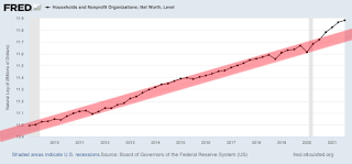
Household Net Worth

The following chart shows the natural log of household net worth. When using natural logs, constant exponential growth is seen as a straight line. I have added a long-term trend channel in red.


Friday, September 23, 2022

SPY vs. TLT

The following chart compares the investment performance of SPY to TLT, as a ratio between the two. I have added 3 trend channels in blue, red, and green.

Chart courtesy of StockCharts.com.

You're a true optimist if you believe any of the following::

1. There's any chance that we'll stay in the green channel long-term.
2. There's a reasonable chance that we'll stay well above the red channel long-term.
3. Entering the blue channel ever again would be absolutely, totally, and in all other ways inconceivable.

I'm not saying that you would necessarily be wrong to be a true optimist, and that the future we will find ourselves in truly could be the best of all possible worlds. However, I am saying that if you are a true optimist right now, at this moment, then I'd sure like to be smoking what you're smoking!

I am not an optimist. You can try to pry the shares of TLT from my cold dead fingers, but I'm not dead yet. Might seem that way as I patiently wait for trends to break though! Trends break. That's what they do. And each time the Fed raises rates, it puts us one step closer to the edge.

Monday, September 12, 2022

Illusion of Rationality

The following chart compares the yield of the 20-year Treasury bond (in black) to the average of the 10-year and 30-year Treasury bonds (in red).


Current Yields

10-Year: 3.37%
20-Year: 3.76%
30-Year: 3.53%

The 20-year Treasury bond currently yields a whopping 0.31% more than the average of the 10-year and 30-year Treasury bonds. How likely is that rational?

You could use rational arguments to convince me to sell TLT and take my losses, but don't you dare tell me to sell 20-year Treasury bonds and buy 10-year and 30-year Treasury bonds instead, while simultaneously p$*sing down my back while claiming it's raining. No sir, of all the bonds I'd think about selling right now, the 20-year Treasury bond would be near the very bottom of the list. But hey, maybe that's just me.

Wednesday, May 18, 2022

How Bad Could It Get?

The following chart shows the natural log of household and nonprofit net worth divided by the consumer price index. When using natural logs, constant exponential growth is seen as a straight line.

The future's so bright, I gotta wear shades night vision goggles.

Friday, May 6, 2022

Producer Price Index

The following chart shows the natural log of the producer price index for all commodities. When using natural logs, constant exponential growth is seen as a straight line.


We've been screaming towards the top of the channel like a runaway train. Our engineer (the Fed) is now desperately attempting to apply the brakes. The odds of a soft train landing seem incredibly low. Beware the rapidly approaching Deadman's Economy Curve. We're likely to derail!

Some might argue that we've already derailed. The worst is now behind us. I'm not convinced. Since when has maximum pain been achieved with near record low unemployment? It seems to me that we still have plenty of pent-up depressionary pain potential. Surely the unemployment rate has not achieved a permanently low plateau, especially given all the financial pain both the stock and bond markets have recently dished out. In fact, it's entirely possible that the pain party might just be getting started. Perhaps the Great Recession will be followed up with an even greater one. *cringe*

This is definitely not financial advice. I am and have been very concerned about our long-term future, much like many must have been during the fall of the Roman Empire. Who is responsible? We all are.

No single raindrop believes it is to blame for the flood.

Thursday, April 21, 2022

Like Roths to the Flame

Chart courtesy of StockCharts.com.

Chart courtesy of StockCharts.com.

Safety seeking momentum traders have clearly fled long-term government bonds and piled into the riskier bond alternatives of consumer staples and utilities. The dividend yields are now SO low, even as long-term bond yields have sharply risen. In my opinion, it will someday end in tears. Think consumer staples [Hostess Brands] can't ever go bankrupt? That there isn't intense competition within the sector? Think utilities [California's Pacific Gas and Electric Company] can't ever go bankrupt? Good luck on those theories.

In order to invest in either stock market sector now I'd need to be compensated for the extra risk. As a recent investor in both sectors, just not seeing the future rewards any longer. At all. In the last few months, it's been like a wild train ride to crazy town. Want absolutely no part of it. The bargains are gone and all that's left is empty momentum driven euphoria. Just an opinion, of course. Can't speak of your opinion on the level of this insanity. Perhaps, unlike me, you feel that relative parabolic moves higher are now the new normal? All I can say is heaven help us all if you are right.

Tuesday, April 19, 2022

Trading Update X

In my IRA, all in on TLT @ $119.20. No longer sitting in cash awaiting opportunities. Long-term interest rates have reached the level I predicted in March of 2021. The 20-year bond looks to be the best bargain of the bunch, perhaps because TLT is now so unloved by retail investors and has a similar maturity.

The following chart shows the natural log of the 20-year Treasury bond yield. When using natural logs, constant exponential growth (or in this case, decay) is seen as a straight line. We have reached the trend line in red.


As is usual with my investments, this is intended to be a long-term holding. There's a lot of risk here, but if I am right about the particular path of our long-term future, then I feel pretty good about it. Well, as good as I could feel believing in an illusion of prosperity anyway. Counting on the Fed to engineer some sort of a landing. I do expect the plane to touch the ground again. Hindsight may easily show that touch was way too gentle a word though.

Markets are constantly in a state of uncertainty and flux and money is made by discounting the obvious and betting on the unexpected. - George Soros

Friday, April 8, 2022

Brace for Impact

The following chart shows the natural log of the consumer price index for food and beverages. When using natural logs, constant exponential growth is seen as a straight line. I have added green and red trend lines to show how the growth has changed.


This is your captain. While a soft landing is still theoretically possible, please brace for impact. Place your feet firmly on the floor, tuck your arms and elbows close to your sides, bend over your thighs as tightly as possible, and tuck your head as closely as possible to the surface you are most likely to strike when slammed forward. Thank you for choosing to fly with Federal Reserve Airlines. We hope you have enjoyed your flight, the upcoming landing notwithstanding.

Friday, January 28, 2022

Household Net Worth


Behold the household wealth creation of a pandemic combined with ZIRP. Broken window fallacies be damned. Break them, and break them good I say. It's a brand new era of unprecedented prosperity! And should this plan ever start to falter, look for plague, pestilence, and NIRP to save the day!!

Seriously. Other than recent bitcoin and stock market performance, there's absolutely no reason to fear downside risk or reversion towards the mean theories. Even in uncharted territory, the Fed always knows what it's doing. Always has your back!

I know I said I was serious in the last paragraph. It was gallows humor. Sorry about that. I actually just bought more I-Bonds. Not only do they track inflation as seen in the CPI, but they can never deflate. Not that many are all that worried about deflation again. Yet.

Thursday, January 20, 2022

Risk Off Is Not a Recent Development

The following chart shows how utilities are performing relative to the Nasdaq over the past 6 months. Note that utilities have been outperforming the Nasdaq since Halloween, which oddly enough is the same time I decided to go on a diet. Pure coincidence? Or is it all part of the same risk off mindset? I cannot say.

Chart courtesy of StockCharts.com

First they came for the Nasdaq
And I spoke out
Because the Internet really needs more bloggers stating the obvious


Here's something less obvious. Next they came for utilities? Interest rates have risen. The spread between utility dividends and the yield on the 10-year Treasury bond is dangerously narrow. Those who bought utilities as a bond replacement (such as myself) should be finding less value there now. For what it is worth, it is that narrowing spread in "safe stocks" that triggered my flight to safety just 10 days ago. The situation has definitely not improved.

Plenty of risk out there and not much value. Doesn't feel at all like it did through most of 2021. The headwind to tailwind ratio has increased dramatically.