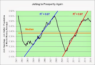
Click to enlarge.
This musical tribute is dedicated to the financial experts who predict that employment growth is destined to accelerate to the upside from here.
)
Source Data:
St. Louis Fed: Custom Chart
I live in the USA and I am concerned about the future. I created this blog to share my thoughts on the economy and anything else that might catch my attention.


4 comments:
I think I saw a similar chart on Calculated Risk last week, except the trend was heading toward infinity. I thought infinity jobs was a little optimistic, but then I have a finite mind and live in a finite world, unlike most "serious" economists.
Mr Slippery,
He does enjoy an optimistic story. Perhaps I can lighten my chart up a bit with a bit of rearranging of variables and what not. You know, really bring out a ray of sunshine or something.
This chart shows the semiannual job openings to job quits ratio.
Why does the ratio only seem to go down when times are really bad or are about to be really bad?
Hmmm. I may need to work more on my technique. I don't seem to have the optimistic "this world is the best of all possible worlds" mindset yet. I'll keep working on it though, lol. Sigh.
Gallows humor.
What you are missing is that there is no gray recession bar on that chart. See how different things are this time? The Fed has the recession possibility at 1.12% which is crazy talk. They always get that call right (...in hindsight,...by about a year).
Mr Slippery,
Perhaps it's like hiking up and down mountains? The best part's at the top? That's where the most euphoria is?
Thanks for helping me with my optimism problem, lol. Sigh.
Post a Comment