

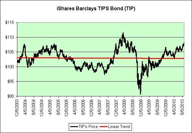
This chart surprises me a bit. The increasingly noisy data still generates a perfectly flat trend line. Age of Turbulence?
The first major trip below the trend was when the stock market was rising rapidly from 2005 to 2007. Money flowed out of safe assets and into riskier assets.
The second major trip below the trend line was when the stock market was falling rapidly in late 2008. Money flowed out of inflation protected assets and into deflation protected assets.
It's been a day since I sold TIP in my IRA. So far, so good.
Source Data:
Yahoo: TIP Historical Prices

4 comments:
Keep in mind that TIP pays out all interest and inflationary gains. You would therefore not expect the price of TIP to change all that much over the long-term.
Hey Mark!
I could not resist pointing you to this video:
http://www.youtube.com/watch?v=tieA5wfcgH4
Total classic, sarcasm on full throttle! (Not safe for work)
GYSC,
That is THE funniest thing I have seen in a LONG time! LOL!!!
Good grief. I think my IQ dropped a few points but it was definitely worth it, lol.
Just imagine if it was combined with this. (Also not safe for work)
Post a Comment