Monday, September 30, 2013

Kerosene-Type Jet Fuel


Click to enlarge.

Economics is not rocket science. It just looks like it sometimes.

Jet Fuel

Oil prices increased about fivefold from 2003 to 2008, raising fears that world petroleum production is becoming unable to keep up with demand. The fact that there are few alternatives to petroleum for aviation fuel adds urgency to the search for alternatives. Twenty-five airlines were bankrupted or stopped operations in the first six months of 2008, largely due to fuel costs.

Source Data:
EIA: Petroleum
St. Louis Fed: Population

Consumer Price Index Since 2008

The following chart shows what the consumer price index has done since hitting the bottom in December of 2008. I have added a 2nd order polynomial trend line in red (excluding the temporary deflationary deviation from February 2010 to April 2011).


Click to enlarge.

It's an awesome display of gravity if ever I've seen one.

September 26, 2013
Where Is the Panic Over Deflation?

But it's striking that the Fed's preferred price measure is declining at a time when the main conversation among policy makers is when and how to tighten monetary policy, rather than to make it more accommodative.

September 30, 2013
Warning - Deflation Will Take the Most by Surprise

The last thing on the minds of most people is deflation.

In my very humble opinion, ZIRP is going to be with us for what will seem to be an eternity, just like it was in Japan. It is also my very humble opinion that our stock market won't like much better than Japan's did. Not right away perhaps, but eventually.


This is not investment advice.

Source Data:
St. Louis Fed: CPI
St. Louis Fed: Nikkei Stock Average vs. Discount Rate for Japan

Sunday, September 29, 2013

Federal Deficit as Percent of GDP


Click to enlarge.

The future's too bright.

Merriam Webster: Pretension

an allegation of doubtful value

This post inspired by robj's comment at Calculated Risk.

Source Data:
St. Louis Fed: Federal Surplus or Deficit [-] as Percent of Gross Domestic Product

A Retail Sales Accident Waiting to Happen (Musical Tribute)


Click to enlarge.

Monthly retail and food services sales per capita is shown in blue.
Annual median household income is shown in red.

Please factor in that neither series is adjusted for inflation. You are therefore looking at the raw data in all its grandeur.

We must be incredibly optimistic as a society. I say this because the following is what Google offers me as search results.

1. 8,870,000 search results for "Pent-Up Demand"
2. 230 search results for "Pent-Down Demand"

As for the latter, my blog currently holds the top search result. Hurray! And with this post, I'm looking to expand my dominance of the "Pent-Down Demand" analysis market! Most excellent! Sigh.


If you're happy and you know it, pent demand!
If you're happy and you know it
And you really want to show it
If you're happy and you know it, pent demand!

Next up... Stomping our feet and turning around! Woohoo!

September 5, 2013
August Retail Sales Shy of Hopes

Many retailers, including the major department stores, have stopped reporting monthly results over the past year, making it more difficult to gauge the performance of the entire industry.

Where have we heard that before?

"The reason those guys don't want to report same-store sales is because they're in a lot of trouble. They have a broken business model, and they would sorely wish analysts would pay less attention to what they're doing. They're trying to hide." - Peter Morici, 2008

And on that note, I am officially reducing my short-term inflation outlook (as seen in the upper left corner of my blog) to boringly flat just in time for the 2013 Christmas season. It's just a gut feel, nothing more.

This is not investment advice.

Source Data:
St. Louis Fed: Custom Chart

Quote of the Day

September 29, 2013
Golden era of farm prosperity in Iowa, nation at an end

Farmers may still be the richest people many of us know, but their seeming license to print money during a seven-year run of record grain prices and near exponential growth in land values has been revoked by falling markets for corn and soybeans.

The Affordable Housing High-Wire Act

The following chart shows the median price of new homes sold divided by the median household income.


Click to enlarge.

HUD: Affordable Housing

Who Needs Affordable Housing?

More people than you might realize.


May 2013
REALTOR: Not a High-Wire Act

The economic benefits of a strong housing market are clear. Housing has contributed 17 to 19 percent to the national gross domestic product on average over the past four decades; it still accounts for about 15 percent of GDP despite ongoing challenges to housing markets around the country. And home ownership remains the greatest tool for wealth creation our nation’s families have.

Parabolically increasing home prices relative to income for the win! It's the greater fool's greatest tool!

Source Data:
St. Louis Fed: Custom Chart

A Reason for Optimism: Washington, D.C.

The following chart shows the median household income of Washington, D.C. divided by the median household income of the United States.


Click to enlarge.

Exponential growth! It's only a matter of time before our "investment" pays off! Genius!

The Next Biggest Boom Towns In The U.S.

No. 6: Washington, D.C.

The D.C. metro area's great competitive advantage lies in proximity to the federal government. Washington has continuing job growth, including in high-wage science and tech fields, and an improving real estate market. It's also the only large metro in the Northeast with close to double-digit gains in the ranks of small children, a sign that people believe they can build a long term future there. However, a significant downsizing of the federal government in the near future could slow the region's growth.

Let's all move to Columbia! Yes!

And when I say Columbia, I don't mean the state capital of South Carolina. There's some sort of "plague" going on there. For the love of all that is holy, stay away!

September 19, 2013
Declining income, rising poverty plague SC economy

COLUMBIA, SC — South Carolinians were better off at the turn of the century than they are today, according to a new report released Thursday.

It finds the state’s residents bring home less money in their paychecks and more are living in poverty than in 2000. Also, fewer have health insurance compared with five years ago, according to the U.S. Census’ American Community Survey.

I also don't mean that we should move to the Mall of Columbia. That's just silly talk. We don't need to live in a Banana Republic quite yet. Give it a few more years!

And let's not forget the country of Columbia. It would make a very poor substitute for the flourishing District of Columbia.

So when it comes to Columbias, one stands above the rest. Stick with what works! The future's so bright there that I gotta wear shades!

See Also:
Sarcasm Disclaimer

Source Data:
St. Louis Fed: Custom Chart

Saturday, September 28, 2013

Business Loans vs. Deposits


Click to enlarge.

For the love of all that is holy, please stop depositing so much cash in the banks. They've already got the Holy Grail. They certainly don't need yours!

Some of us would like to actually earn more than 0.49% on 5-year CDs again. So stop already!

1.0049^5 = 1.0247

2.47% total return in 5 years? I say bury that cash instead! What's the worst that could happen?

The Worst that Could Happen


Do *not* weasel your investment! Bury it deep! Cash makes a horrible mulch!

This is gardening advice and as such should not be confused with investment advice.

See Also:
Hyperinflation Theories Poned Again

Source Data:
St. Louis Fed: Custom Chart

Quote of the Day

September 26, 2013
China investment opportunities today: Jim Rogers

"In the 19th century in America, we had 15 depressions, with a 'd', and yet we became the most exciting and successful country in the 20th century."

"China's gonna have a lot of problems. I don't know what or when or why, but I know it's coming. But when they happen, take advantage of the opportunity, don't throw up your hands and say 'oh gosh, now I'm going to Denmark to learn Danish' or something."

Based on what I've heckled about China on this blog in the past, I'd definitely be throwing my hands up if I moved to China to learn Chinese. I'd be surrendering to the totalitarian authorities. No doubt about it. Sigh.

So yeah, if forced to choose, I'd prefer to go to Denmark to learn Danish' or something.

I consider myself very fortunate to have been born in America. This freedom allows me to publicly state that I believe Jim Rogers is a total doofus. This is not his first quote of the day. He's always full of inspiring "sarchasmic" witticisms!

This post inspired by "The High Price of Digging Up Dirt in China" as seen at Credit Bubble Stocks.

Friday, September 27, 2013

The Path to Infinite Leverage (Musical Tribute)

The following chart shows the inverse of the 10-year treasury yield. Why the inverse? At 0%, one could borrow an infinite amount of money and still pay the interest payments in full (without even breaking a sweat). When seen this way, 0% isn't a floor. It's infinity!


Click to enlarge.

Note that there has been a trend change. As seen in the difference between the red and blue exponential trend channels, the inverse is growing even faster than it once was. What does this mean? Rising interest rate environment my @$$! That's what. Just an opinion of course. Your opinion can and probably does vary.

But before you disagree, consider this. Our modern financially innovative over-leveraged society *requires* an exponentially increasing amount of leverage, lest it seize up (again). If not, please provide evidence to the contrary. I'm all ears. Further, an economy seizing up tends to be disinflationary (compared to what it was before it began to seize).

If I am right, then we better start learning Japanese economics, because that's where we are headed apparently. Welcome to the era of perma-ZIRP. And when I say perma-ZIRP, I do not mean over the next 10,000 years. It could easily be a LOT longer than most people think though. For savers looking for a relatively safe return, I expect the beatings to continue until morale improves. It's one reason I have not been scared about locking in long-term interest rates whenever the opportunity presented itself.


When you're at the end of the road
And you've lost all sense of control
And your thoughts have taken their toll
When your mind breaks the spirit of your soul

Your faith walks on broken glass
And the hangover doesn't pass
Nothing's ever built to last
You're in ruins

This is not investment advice. It's just the opinion of a perma-bear. That said, who honestly believes that the hangover is passing? We're not just drinking a hair of the dog that bit us. We're attempting to drink the whole frickin' dog again. Good luck on that one long-term!

Source Data:
St. Louis Fed: Custom Chart

Thursday, September 26, 2013

T'Paper (Musical Tribute)

Here's what we now know about monetary tapering policy:

1. The paper must be tapered. T'Paper!
2. The last attempt was a one hit wonder.


Give a little bit of heart and soul
Give a little bit of love to grow
Give a little bit of heart and soul
And don't you make me beg for more

Give a sign, I need to know
A little bit of heart and soul

Walking on the water, walking on the air
That was the heart of the love we shared
Do you keep secret left untold
Can't give love, heart or soul

I used to have a lover with a Midas touch
I turned to gold but he turned to dust
Left me for another, I turned to stone
Now give me love, heart and soul

Living in a fantasy
There's never any room to breathe
Hoping every waking hour
You'll turn around and say that we can start

Our Flubbered Economy


Click to enlarge.

Department store sales per employee and adjusted for inflation are going parabolic! Yay.

September 26, 2013
Fox Business News: JCP Shares Rebound; Retailer Pleased with Progress

Retailer J.C. Penney Co Inc (JCP) said it was pleased with the progress of its turnaround efforts and still expected positive comparable-store sales trends coming out of the third quarter and throughout the fourth.

The headline actually makes sense! Way to go Fox Business News!

The cost to insure $10 million of J.C. Penney bonds against a default for five years now requires an upfront payment of about $2.2 million plus quarterly payments of about $300,000 for the duration of the contract. The contract's pricing reflects a default probability of nearly 65 percent.

The retailer must be very pleased indeed! Let's look closely at the rebound in shares too while we are at it. Shares fell a whopping 15% yesterday and are currently bouncing back up 3% today. Yes, indeed! Very pleasing!

September 24, 2013
Sears Canada CEO to leave amid clash over revamp

In a surprise move, Sears Canada Inc. chief executive officer Calvin McDonald is leaving more than two years after having spearheaded a transformation of the struggling retailer, raising questions about its revival in the industry’s increasingly tough landscape.

Boo! Hiss!

Sources familiar with the situation said the departure was sparked over differing views with parent Sears Holdings Corp., whose controlling shareholder is Edward Lampert. The disagreement was tied to “the pace at which capital was being deployed to keep the momentum of the transformation going,” according to a source.

Boo! Hiss!

What about Macy's? No need to worry! That stock's been on fire lately! Just like it was in 1999 and 2007! What's the worst that could happen?


Click to enlarge.

Macy's stock has been flubbered! To infinity and beyond!

Flubber is a non-Newtonian fluid that flows under low stress, but breaks under higher stresses and pressures.

No more stress! No more pressure! From here on out, it's nothing but exponentially increasing corporate profits! Thanks to this new and improved Fed, recessions will never be tolerated again! Hurray!

Flubber trends were first discovered by Rob Dawg in the comments found here. Genius!

Source Data:
St. Louis Fed: Custom Chart
Yahoo Finance: Macy's Historical Prices
St. Louis Fed: CPI

Wednesday, September 25, 2013

Nonfinancial Corporations Sector: Hours Worked


Click to enlarge.


Source Data:
St. Louis Fed: Nonfinancial Corporations Sector: Hours Worked

Household Net Worth vs. Total Credit Market Debt Owed


Click to enlarge.

What pessimists see:

1. We're in a long-term linear trend channel heading to zero.
2. We're at the top of the trend channel again (last seen in 2006:Q1 and 2000:Q1).

What optimists see:

3. Yes, but net worth can't fall below zero. The downward trend is therefore guaranteed to fail someday!

It's nice to see both camps in complete agreement here, lol. Sigh.

See Also:
Sarcasm Disclaimer

Source Data:
St. Louis Fed: Custom Chart

Household Net Worth vs. Disposable Personal Income


Click to enlarge.

Despair.com: Meetings

None of us is as dumb as all of us.

Source Data:
St. Louis Fed: Custom Chart

Tuesday, September 24, 2013

Chicago Fed National Activity Index (Musical Tribute)

The following chart shows the 3-year moving average of the Chicago Fed National Activity Index. I have added a 2nd order polynomial trend channel in red.


Click to enlarge.

Gotta love optimism. Assuming that the trend channel holds (might not), then we definitely live in the best of all possible worlds right now. We're hugging the top of that declining channel like glue. Yay.


See Also:
Sarcasm Disclaimer
Trend Line Disclaimer
Where am I going and why am I in this handbasket?

Source Data:
St. Louis Fed: Chicago Fed National Activity Index

10-Year Treasury: FED a Story


Click to enlarge.

The Fed was even more shocked than I was to see just how many people instantly converted to the belief that the 10-year treasury yield would breach 3% and continue to rise for the foreseeable future (even in a short-term 0.04% interest rate and sub-par employment growth environment).

September 24, 2013
Fox Business News: Prepare Your Portfolio for Rising Interest Rates

You've been warned -- for years -- about the impact of rising interest rates on bonds and what that might do to your portfolio.
...

Calling in expert help could be useful for individuals as well. If the thought of figuring out bond durations and premiums versus par seems too daunting, consider visiting a fee-only financial planner or adviser. Investment planning is a full-time job for a reason. It can be complicated.

If you can't trust the financial "experts" at Fox Business News to help you line the pockets of financial planners and advisers, then who can you trust?

I've definitely been warned for years. No doubt about that. It's all just a big adventure to me though. I'm a loner, a rebel.


This is not investment advice.

See Also:
Sarcasm Disclaimer

Source Data:
St. Louis Fed: 10-Year Treasury Yield

Long-Term Oil Price Trends

The following chart shows the 5-year, 10-year, and 20-year moving averages of the price of crude oil in inflation adjusted terms (August 2013 dollars).


Click to enlarge.

There is no good news in the 10-year and 20-year moving averages. Both are currently at record highs and climbing.

The only good news here is that the 5-year moving average is rolling over. However, this news is offset by the fact that the current price of oil @ $102.73 is well above the 5-year moving average. Should it stay there then the rolling over will be temporary.

What could cause the 5-year moving average to continue to roll over? A recession brought on by high-priced oil could certainly do it. For the first time in U.S. history (March 2012 to March 2013), the real price of oil averaged more than $90 over a 5-year period (August 2013 Dollars). What a drag.

For what it is worth, nothing tends to kill higher prices like higher prices (most bubble watchers would agree). Note that the perpetually increasing upward trend in total miles driven has failed.

No predictions here, simply observations.

Source Data:
St. Louis Fed: Crude Oil Prices (WTI)
St. Louis Fed: CPI

Sunday, September 22, 2013

Business Loans vs. Consumer Loans (Musical Tribute)


Click to enlarge.

As seen in the following chart, I really don't think we're going to make it back to the top of the parabolic trend channel any time soon.


Click to enlarge.

It would seem that businesses (in comparison to consumers) have just about had their fill of Bernanke's Free Money Spell.


Money Spells: Cast a Free Money Spell

Choose this money spell to receive a large sum of money or make someone else receive a large sum of money.

Testimonials:
These are Real Spells that work for free

Genius! Why don't more people know about this? It's so simple, it's bound to work!

See Also:
Sarcasm Disclaimer

Source Data:
St. Louis Fed: Custom Chart

Social Insecurity (Musical Tribute)

The following chart shows the 10-year moving average of personal current transfer receipts divided by private production and nonsupervisory employee earnings. I have added a parabolic trend line in red.


Click to enlarge.

Can you say epic trend failure?

AC/DC - Down Payment Blues


Get myself a steady job
Some responsibility
Can't even feed my cat
On Social Security

Hiding from the rent man
They make me wanna cry
Sheriff knockin' on my door
Ain't it funny how the time flies

Source Data:
St. Louis Fed: Custom Chart

Saturday, September 21, 2013

Revolving Credit vs. Disposable Personal Income (Musical Tribute)

The following chart shows the 10-year moving average of the natural logarithm of the ratio of revolving credit to disposable personal income.


Click to enlarge.

When using natural logarithms, constant growth is seen as a straight line. We aren't seeing a straight line though. Instead, we're seeing a nearly perfect upside down parabola.

Over the long-term, this particular growth engine is done. Stick a fork in it.

The future's so bright I gotta roll over in symphony. (Pun intended.)


Source Data:
St. Louis Fed: Custom Chart

Friday, September 20, 2013

The Typical Retail Trade Employee's Near Miss

The following chart shows the 12-month moving average of weekly hours worked by production and nonsupervisory retail trade employees.


Click to enlarge.

This is your captain. I have good news and bad news.

First, the good news. Although it appeared to be a sure thing, I am pleased to report that we averted the disaster of hitting the median. The plane stalled just in the nick of time.

Now, the bad news. Similar to the period from 2003 to 2009, we are once again screaming towards the ground again. Please assume crash positions.

See Also:
Sarcasm Disclaimer

Source Data:
BLS: Employment

Red Lobster in Mourning (Musical Tribute)

September 20, 2013
Revamps for Olive Garden, Red Lobster fall flat

Despite the moves, sales fell 4 percent at Olive Garden restaurants open at least a year in the latest quarter. The figure was down 5.2 percent at Red Lobster, where the company added more non-seafood options to attract a broader audience. Darden has blamed its troubles on a variety of factors, including more cautious spending by consumers.

Red Lobster at night
Investor's delight
Red Lobster in mourning
Investor's warning


This post inspired by Watchtower in the comments found here.

See Also:
Is the old adage “Red sky at night, sailor’s delight. Red sky in morning, sailor’s warning” true, or is it just an old wives’ tale?

Peak Covered Employment per Capita


Click to enlarge.

How can any rational person look at that chart and only see the best possible outcome?

As a side note, we're currently being pulled down and away from the long-term parabolic trend by the 41% reading in July.

Update:

Here's a chart of the raw data so you can see where we currently are relative to the long-term trend.


Click to enlarge.

Source Data:
St. Louis Fed: Custom Chart

Thursday, September 19, 2013

Pop Quiz: Bernanke vs. Berezniki

Which one has the more unstoppable sinkhole policy?

Bernanke:

January 6, 2010
Obama Backs Bernanke for Likely 2nd Term - CBS News

The Fed is all but certain to keep its key bank lending rate - it affects a wide range of rates on consumer loans - at a record low near zero when the meeting concludes on Wednesday.

It is also expected to renew a pledge to hold rates at record lows for an "extended period" to nurture the recovery. Economists think that means rates will stay where they are for at least six more months.

At least 6 months! And in hindsight, give or take 5 years or more! Hurray!

Berezniki:

13 of the Biggest, Strangest, and Most Devastating Sinkholes on Earth

2. Berezniki

In Soviet Russia, the ground moves you. Berezniki’s sinkhole began in 1986 and just grows worse with each passing year. It’s unstoppable. Currently it’s over 200m deep, 80m long and 40m wide. In case you’re thinking “Berezniki? Who cares?” you should know that 10% of the world output of potash comes from this area, and the sinkhole is very close to destroying the mine’s sole rail line.

Unstoppable! Very close to destroying the mine's sole rail line! Hurray!

Too much sarcasm?

Real Retail And Food Services Sales per Retail Employee (Musical Tribute)


Click to enlarge.


Source Data:
St. Louis Fed: Custom Chart

Real Annualized International Trade per Capita


Click to enlarge.

Let's zoom in for a closer look.


Click to enlarge.

Sorry, China. It looks like we're pretty much done being your exponential growth engine.

August 11, 2013
China Faces Years Of Slowing GDP Growth, Top Strategist Says

“We need to get used to the fact that the boom is over,” said Andy Rothman, China macro strategist at brokerage CLSA. “The days when you could just roll out of bed and make money, or the days when you could expect that the growth rate for most things was going to be faster next year — that’s done. We should expect that for the foreseeable future, every year on average, most major economic data points are going to be growing more slowly.”

It could never happen here of course. This is America. Thanks to perma-ZIRP, booms will never end again! Hurray!


Don't mind us we're just spilling our guts
If this is love I don't wanna be hanging by the neck
Before an audience of death

See Also:
Sarcasm Disclaimer

Source Data:
St. Louis Fed: Custom Chart

Wednesday, September 18, 2013

The Taperworm Hungers!


Click to enlarge.


I am Sinistar.
Beware, I live.
Run! Run! Run!
Beware, coward.
Run, coward.
Raaaaarrrrrrr!
I hunger.

I'm experiencing a strange feeling of déjà vu.

September 18, 2013
Bernanke Is Terrified Of Higher Mortgage Rates And The Debt Ceiling Debate

In his post-FOMC press conference, Fed Chairman Ben Bernanke made it clear that he had lost control of the market, causing a tightening of financial conditions that directly hit the highly supported housing market through higher mortgage rates.

See Also:
The Tapeworm Hungers!

Source Data:
St. Louis Fed: 30-Year Conventional Mortgage Rate (YoY)

Real Net Personal Interest Income Growth


Click to enlarge.

That's a fairly impressive downdraft (in blue), especially if one considers just how much money is out there to earn interest.

1. ZIRP once helped borrowers, especially long-term borrowers with good credit who managed to refinance their homes at much lower interest rates. I'm not so sure it is helping many now though. Credit card interest rates have certainly not fallen much in the last 10 years.

2. ZIRP continues to hurt savers, especially short-term savers who patiently wait for the end of ZIRP.

“Patience – A minor form of despair, disguised as a virtue.” - Ambrose Bierce, The Unabridged Devil's Dictionary

Let me assure you that I generally have plenty of patience and despair, but not nearly enough to sit in treasury bills long-term. I've been a permabear since 2004. In hindsight, sitting in treasury bills would have been an awful plan.

From what I can see, the "average" American currently earns 5x more interest than he/she pays. As monetary economic stimulus goes, at some point ZIRP could easily hurt savers far more than it helps borrowers. We may have already reached that point, just like Japan before us.

As a side note, I really don't think the typical American is personally earning 5x more interest than what is paid. Toss a few billionaires into any party and the average starts looking pretty good. That's not enough to make the typical American rich though, unless streams of cash spill out of pockets as the billionaires wander around the room. You know, trickle-down economics and what not. Cash falling out of billionaire pockets is about as likely to happen as the end of ZIRP, at least in the near-term.

I will end here with 100% certainty. I am a long-term retired saver and the Fed's zero interest rate policy is forcing me to spend less than I otherwise would, lest my nest egg run dry before I die of old age. It's not a complaint. It's simply a fact. Spending less is a rational reaction to lower real yields. That's not what the Fed intended me to do of course. Call it an unintended consequence. This uncertain world is full of them.

Source Data:
St. Louis Fed: Custom Chart

The Monetary Policy No-Fly Zone (Musical Tribute)

The following chart shows the 10-year moving average of the natural log of M2 money stock times the 10-year treasury yield. I'm using the natural log so exponential growth is seen as a straight line.
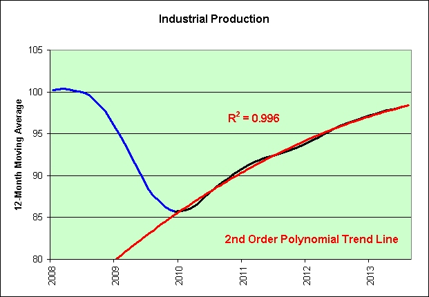

Click to enlarge.

Note that there are two long-term trends in the chart and they are both straight lines. Technically speaking, the transition between the two represents an exponential trend failure. Here is a chart of the data before the natural log is applied to more clearly show that failed exponential growth trend.

As seen in the chart, this "new and improved" modern economy can apparently only tolerate a continually expanding money supply *and* a continually declining 10-year treasury yield.

On the one hand, it was a therefore a mistake to enter the no-fly zone during the last 10 years. The attempt was shot down in flames as we entered the Great Recession. On the other hand, it was also a mistake to let the price of oil rise so much. It helped us attain a Great Recession too. Can you say caught between Iraq and a hard place? Pun intended. Two mistakes can't make a right here, especially since both mistakes cannot be made at the same time! The Fed must choose one or the other.

M2 is currently $10,790 billion. It would therefore currently take a 10-year treasury yield of just 2.29% to hit the median of 5.51.

LN(10,790 x 2.29%) = 5.51

On that first hand again, any rate above 2.29% on the 10-year treasury risks making a similar mistake. And on the other hand, there goes oil again. Is it any wonder that the Fed is running scared today? Two mistakes! Must choose one!

“This FOMC edition feels less dovish than it does outright scared,” Mr. Green says.

I would suggest that the 10-year treasury could easily yield under 2.29% again in the not too distant future, or we'll die trying (recession). And if the price of oil rises more, we'll die trying anyway. It's only a matter of time.

The vast majority of "financial experts" felt that 3% and higher was a sure thing. In sharp contrast, I was and am a long-term believer in The Long-Term Death of Real Yields theory. It's just going to get harder and harder to make money off of money.

This economy continues to suffer under the illusion of prosperity. This is one of the weakest recoveries we've ever had and yet all I hear about on the TV is how resilient we are. It reminds me so much of the 2003 to 2007 era. Pardon my language, but three more years of Goldilocks my @$$.

What will the next recovery look like if/when we enter the next recession during ZIRP? I'd say the odds definitely favor it so perhaps it is best to think up answers now rather than when it is happening. As they say, if one must panic at least panic first. And when might hindsight show was a great time to panic? Hard to say. Nothing brings more illusionary confidence than a Fed running scared.


Once again, just opinions. This is not investment advice.

See Also:
The Inflationary No-Fly Zone

Source Data:
St. Louis Fed: Custom Chart

Monday, September 16, 2013

The Inflationary No-Fly Zone


Click to enlarge.

It's an exponential trend failure two-fer.

No-fly zone

A no-fly zone (or no-flight zone) is a territory or an area over which aircraft are not permitted to fly. Such zones are usually set up in a military context, somewhat like a demilitarized zone in the sky, and usually prohibit military aircraft of a belligerent nation from operating in the region. Aircraft that break the no-fly zone may be shot down, depending on the terms of the NFZ.

No matter how hard we try (and we have made so many attempts), we cannot seem to punch through the record high set in July of 2008. Seriously. So close and yet so far!

I find it very hard to believe that the PPI will permanently hug the border of the no-fly zone. Then again, I could be wrong. Perhaps there is a relationship between hugging and ZIRPing. Japan faced 20+ years of flat consumer inflation. We've seen roughly 2 straight years of flat PPI inflation.

The Fed's ZIRP is the largest monetary operation ever mounted. Quite frankly, this kind of thing's never been attempted before in the United States.


It will be the largest airborne operation ever mounted. Quite frankly, this kind of thing's never been attempted before. We shall seize the bridges. It's all a question of bridges, with thunderclap surprise, and hold them until they can be secured.

The operation will continue until all the bridges can be secured. I have no doubts about that. Sigh.

This is not investment advice.

Update:

I wasn't happy with the ending point I chose on the second exponential trend in red. It's been updated to end at the short-term peak set in July of 2011.

Source Data:
St. Louis Fed: Producer Price Index: All Commodities

When Will Capacity Utilization Fully Recover?


Click to enlarge.

Perhaps I should have asked a different question.

Source Data:
St. Louis Fed: Capacity Utilization: Total Industry

Parabolic Industrial Production

This is an update to Friday's industrial production post.


Click to enlarge.

The correlation is the same 0.985 it was on Friday. If you squint, you can see that August was a good month. It did come in slightly above trend, but not by all that much in the grand scheme of things.

Since all I really care about is the underlying long-term trend, let's eliminate much of this monthly noise by using 12-month moving averages instead.


Click to enlarge.

I have rarely seen a more perfect parabola in all of economics; and we are currently riding right on top of it.

Source Data:
St. Louis Fed: Industrial Production Index

Sunday, September 15, 2013

"Quality" Job Growth (Musical Tribute)

The following chart shows the annual growth in quality nonfarm employment. I am excluding retail trade and food services and drinking places jobs, as these are relatively low paying jobs (and generally do not require a college degree).


Click to enlarge.

1. As seen in red, we're currently attempting to hug the high point long-term declining trend.
2. As seen in blue, the overall long-term declining trend has finally reached 0% growth.

How can one not be optimistic when wearing the proper spectacles? Don't even look at the blue trend line. Just stare at where we are on the red trend line! It's still positive! The glasses are therefore still half full!

Seriously, this economy is to dye for! There's no need to be chicken. Swing for the fences! The Fed has permanently put a stop to recessions! What's the worst that could happen?


Chicken Eyeglasses

The idea behind the glasses is to prevent chickens from attacking and cannibalizing one another. Red-tinted lenses, as opposed to other colors, are said to be effective in stopping the internecine pecking because they disguise the color of blood. As summed up in a 1953 article in Indiana's National Road Traveler newspaper, "The deep rose-colored plastic lenses make it impossible for the cannibal [chicken] to see blood on the other chickens, although permitting it to see the grain on the ground."

Yes! More grain! Less life blood!

This is not investment advice. Don't be a victim of sarchasm!

Source Data:
St. Louis Fed: Custom Chart

Saturday, September 14, 2013

Friday, September 13, 2013

Industrial Production Has Gone Parabolic!


Click to enlarge

It's just not the kind of parabola an optimist would wish to see. Sigh.

This post inspired by MaxedOutMama's post: And The Add-on To the YoY Decline in Production Jobs.

Source Data:
St. Louis Fed: Industrial Production Index

Some Perspective on the "Rising" Interest Rate Environment

The following chart shows the 10-year moving average of the 10-year treasury yield.


Click to enlarge.

Rising interest rates? In my opinion, the bond market is simply trying to climb back to the long-term declining trend.

Long time readers know that I post a lot of exponential trend failures on this blog. You might therefore wonder why I trust this one not to fail. The simple answer is that I don't. It's more of a question of which direction it would fail.

I am definitely in the minority. As seen in the chart, we're currently well below trend. I do not believe this economy is strong enough to support a sustained climb back up.

This chart predicts that the 10-year moving average of the 10-year treasury yield will be 3.0% in August of 2018. That's roughly 5 years away. I shall take the under.

It's just an opinion of course.

Opinion has caused more trouble on this little earth than plagues or earthquakes. - Voltaire

My opinion isn't going to do much in the grand scheme of things. If I am wrong, no big deal. I'm in the minority here. Who cares what I think? It is the opinion of the masses, those in ivory towers, and those in power that would concern Voltaire most more than likely.

September 3, 2013
5 ways to prepare for higher interest rates

If you don’t like the idea of buying individual bonds but don’t want to get burned by raising rates, short-term bond funds are an alternative.

Yes, short-term bond funds! It's worked out great so far. Just get in there and patiently wait for the end of ZIRP. It is bound to happen any day now!

Yahoo: SHY Performance

3-Year Total Return (Mkt): 0.56%

This is not investment advice.

Source Data:
St. Louis Fed: 10-Year Treasury Yield

Restaurant Sales vs. Wages


Click to enlarge.


Source Data:
St. Louis Fed: Custom Chart

Thursday, September 12, 2013

The Corporate Profit Singularity (Musical Tributes)


Click to enlarge.

The initial singularity formed in the second quarter of 1968. What a moon shot!

April 18, 1968
The Telegraph: American Space Program Now Gearing Down to Slower Pace

There is a growing feeling in the space establishment that once astronauts have landed on the moon, they will have no other place to go for several years because of budget cuts that have trimmed to the bone all preparations for future missions.

It is as if the astronauts are heading for a dead-end on the moon.

Poppycock! We established an entire moon colony back in 1999. That's common knowledge to everyone who relies on the television for their mainstream information.

Space: 1999 - TV intro (season 1) HQ (1975)


There is no rational reason to panic at these altitudes. Why are we even talking about panicking anyway? I certainly didn't bring it up. What? It was something I said? Just ignore all those exponential trend failures I have posted here in the past if you are that worried about it. The exponential trend channel in the chart above is different. It is totally sustainable. And don't you worry about us being near the top of that trend channel again either. In sharp contrast to 1989, 1997, and 2006, only good things can happen from here. See? No reason to panic! You can invest with the same level of confidence you had back in 1982. Other than an inflation adjusted $8,000 per worker differential in corporate profits between then and now, nothing has actually changed.

The future's so bright I gotta put my space helmet on! We ain't done moon shootin' until I say we're done moon shootin'!

David Bowie- Space Oddity Original Video (1969)


Though I'm past one hundred thousand miles
I'm feeling very still
And I think my spaceship knows which way to go
Tell my wife I love her very much (she knows!)

See Also:
Sarcasm Disclaimer

Source Data:
St. Louis Fed: Custom Chart

Food Employee Growth Anarchy! (Musical Tribute)


Click to enlarge.

This "recovery" might not end well, but it will end. I have no doubts about that.


You better listen, better do what you're told
You haven't even touched your tuna casserole
You better chow down or it's gonna get cold
So eat it

Source Data:
St. Louis Fed; All Employees: Retail Trade: Food and Beverage Stores
St. Louis Fed: All Employees: Leisure and Hospitality: Food Services and Drinking Places
St. Louis Fed: Population

The Tapeworm Hungers!


Click to enlarge.


Source Data:
FRB: Z.1 Release

Wednesday, September 11, 2013

Household Median Income: Optimism vs. Pessimism

For the Optimists:

Click to enlarge.

It's a sure thing! Can't lose!

For the Pessimists:

Click to enlarge.

It's a sure thing! Can't win!

I sure wish there was a way to break the tie between the optimists and the pessimists. I could probably start by pointing out that the optimists have at least one thing wrong. Constant growth really should be using an exponential trend and not just a linear one. Here's the problem with a linear trend. If it takes roughly 20 years for median income to double once (as seen in the first chart for the most part), then it will take an additional 40 years for it to double again. See why linear trends kind of stink when it comes to growth?

That's what makes the pessimist case slightly more believable. Growth is definitely slowing. Both charts clearly show it. It's just that the first chart shows it in a much more subtle way. What would happen if the growth continues to slow?

September 9, 2013
Study: Demographics to Drag Down Median Income

Americans who expect wages to rise as the nation recovers from the recession may be in for disappointment. A new report suggests incomes may be headed downhill for decades.

Oh oh. Why?

Pointing to past decades, the economists say median household incomes rose 9 percent between 1979 and 1989 and jumped 13 percent between 1989 and 2000. They say the primary driver of this growth was women, The Wall Street Journal notes.

Women! I knew it! The *real* men among us will just need to convince women to each work 2 jobs! That seems totally doable in this increasingly automated and outsourced world with chronically high unemployment. I suggest, "I bet you can't work *two* jobs! You're just a woman!" That's sure to be a big hit in any household!

And when I say big hit, I mean that the future's so bright I gotta prepare a cold compress for my eye. I'll have quite the shiner! Although optimism means that I can expect the best possible outcome, I just don't have it in me. I'm clearly planning for more of a pessimistic worst-case bodily injury type of outcome, lol.

In all seriousness, we're so @#$%ed long-term. This is not investment advice.

This post inspired by Revolting as seen at Retirement Blues.

Update:

I originally stated that this data was in inflation adjusted dollars. It was pointed out to me in the comments by mab that this data didn't look inflation adjusted though. After further review, he was absolutely right. Although the data source used inflation adjusted data for the 2-year and 3-year median income averages, it did not use it for the single year averages (which I was using). I have added the "my personal blunders" tag to this post. I should have spotted it. All the conclusions here remain valid. In inflation adjusted terms, things are much, much worse.

Source Data:
U.S. Census: Income

A Very Important Employment Trend Change


Click to enlarge.

The noninstitutional population of those aged 16 to 24 divided by the noninstitutional population of those aged 25 to 54 is shown in blue.

The employment level of those aged 16 to 24 divided by the employment level of those aged 25 to 54 is shown in black.

If you look closely, you can see that there is a divergence between the two series starting in 2000. They no longer generally move in the same direction.

The following scatter chart shows the old trend compared to the new trend. I'm using 7 year moving averages to really smooth the data out (which helps eliminate the noise and the temporary effects of short-term cyclical recessions and short-term cyclical expansions). This allows us to more easily spot any structural problems that might remain.


Click to enlarge.

As seen in the chart, there's a new trend in blue and it's looking mighty ugly. I think it really is safe to say that it is different this time.

Pardon my language, but it really sucks to be 16 to 24 years old right now. It would seem that those aged 25 to 54 are not all that willing to give up their jobs in this difficult economic environment. This behavior change did not start in the aftermath of the housing bubble. It actually started at the very height of the dotcom bubble.

Let me be very clear here on what the chart has been saying since April of 2000. The more 16- to 24-year-olds appear compared to their 25- to 54-year-old counterparts, the fewer jobs they get relative to their counterparts. This is a decidedly horrible trend, especially if we someday expect the younger generation to "rescue" the older generation's economy again. You know, by being first-time home buyers filled with irrational exuberance and what not. Sigh.

Source Data:
St. Louis Fed: Custom Chart

This "Recovery" Is Just About Over (Musical Tribute)


Click to enlarge.

Start with retail sales. Subtract off motor vehicles and parts (mostly purchased with excess credit), gasoline station sales, food sales, and nonstore retail sales (since nonstores tend to hire non-employees). Adjust for inflation and divide by the population. The chart shows what's left. It's the perfect recipe for MaxedOutMama's disturbing Utterly Schizoid NFIB Report.

In my opinion, the core economy is running out of steam again. They say nobody rings a bell at the top. I guess everyone is just too busy counting their money while they're sitting at the table.


Source Data:
Census: Monthly & Annual Retail Trade
St. Louis Fed: CPI
St. Louis Fed: Population

National Financial Conditions: Slutty (Musical Tribute)


Click to enlarge.

The National Financial Conditions Index (NFCI) measures risk, liquidity and leverage in money markets and debt and equity markets as well as in the traditional and “shadow” banking systems. Positive values of the NFCI indicate financial conditions that are tighter than average, while negative values indicate financial conditions that are looser than average.


Warning: Not necessarily suitable/safe for work.

Source Data:
St. Louis Fed: Chicago Fed National Financial Conditions Index

Tuesday, September 10, 2013

Repair and Maintenance Employees per Capita


Click to enlarge.

Why would we need more repairs? What's the worst that could happen?


Yeah, it's been getting worse and worse. Oh, it's taking forever to flush. It's like it's stopped up. We've been dumping a lot of sand in there from our floors.


I'm putting in support beams right now, posts in the basement... so we can go ahead and cut these joists out.

Have I mentioned lately that I have no desire to be a landlord? ;)

Evil pranks! And yet I cannot stop laughing, lol. Well, that's not quite true. A quick look back at that first chart stops me. Sigh.

Source Data:
BLS: Employment
St. Louis Fed: Population

New Car Financing vs. Hours Worked


Click to enlarge.

FAIL.

September 6, 2013
Consumers rely on car financing more than ever

Loans now average $457 with payments over 65 months, putting the average amount financed on a new car at $26,526.

Subprime loans to customers with less than a 680 credit score saw an increase, rising from 25.4 percent of loans last year to 27.5 percent in 2013.

Extending payments past four years, and well beyond the typical new-car bumper-to-bumper warranty, suggests people are buying more car than they can arguably afford.

The future's so bright I gotta wear 27.5% subprime shades!

See Also:
The Illusion of an Auto Industry "Recovery"

Source Data:
St. Louis Fed: Custom Chart