I live in the USA and I am concerned about the future. I created this blog to share my thoughts on the economy and anything else that might catch my attention.
This is the End and a New Beginning
-
I've been thinking about this for some time.
After 21 years of writing this blog almost daily, I've decided to stop
writing the daily updates on the blog.
...
Silver Deep Dive
-
Silver had a memorable year (+148%). Some of this can be explained by a
decline in the dollar. I decided to do some ML analysis to look for other
insights....
I've zoomed in to show the detail in the 100 day moving average and how it relates to the exponential trend.
I'm not willing to call this an exponential trend failure quite yet. The data is noisy and it is possible that a new round of uncertainty would allow the trading volume in GLD to resume its former trend. That said, as a gold heretic (at these prices relative to the price of toilet paper) I am certainly tempted.
1. Contrary to popular opinion, we're still in crisis mode. 2. The I-Bond fixed rate cannot fall below zero.
Click to enlarge.
Based on current 5-year TIPS rates, the I-Bond rate would be -0.1%.
Click to enlarge.
Based on current 10-year TIPS rates, the I-Bond rate would be -0.3%.
You will note that the crisis trend lines do not include the last three data points. That's because the 0.0% I-Bond rate is a hard floor and would therefore distort the the picture. I was willing to use one previous 0.0% I-Bond rate (May 1, 2008) but only because I felt the distortion was minimal.
For what it is worth, I did my I-Bond buying in January. I didn't see much hope that I-Bond rates would rise this year. I could be wrong but I still feel that way. This is not investment advice.
I will offer a prediction for the composite rate (including inflation) in a few weeks. In order to make that prediction I will need to see what the CPI did in March. That won't be released untilApril 13th.
I continue to climb the extra 20 flights of stairs each and every day as a long-term plan. It's been 10 months so far. I'm absolutely convinced that it is a permanent habit now.
The good news is that I'm down about 9 pounds from when I started. The bad news isn't hard to spot.
Click to enlarge.
Same story as last month. I'm making no additional effort to adapt. Hopefully I'll turn the corner once the sun starts coming out on a regular basis and the momentum will carry me through the summer again. I have no proof. Although I am not a religious person, I guess you could say I'm working on faith.
In all seriousness, the summers are wonderful in the Seattle area. We get our fair share of sun. The winters make you appreciate them all that much more. I intend on going on a lot more hikes than last year (willingly) and I think my legs can now handle it. In theory, that should help.
I'm reminded of a time I was standing in line behind two people who had recently moved up from California. It was early fall if I recall. They were complaining because there had been a few cloudy days in a row. I secretly laughed to myself and thought, "You haven't seen anything yet!" That was roughly two decades ago. Their conversation had quite the impact on me. How did they ever survive the winter? Hahaha!
I actually don't mind the rain or I wouldn't live here. That doesn't mean I want to take long hikes or do yard work in the mud though. So what do I do instead? Sit on the couch and play video games? Yeah, pretty much. Sit at my desk and blog? Okay, got me there. Deep down there is a lazy person within me who's clearly struggling to get out. And when I say struggling, I may actually mean capitulating, lol.
Fortunately, I am a goal-oriented lazy person. It was my intention to eventually get to the blue zone (in the charts) with the least possible effort. I was originally thinking that it might take up to 5 years. I don't have enough information yet to know if the path I am currently on will get me there. Is this mostly seasonal or not? I think it is, but once again I have no proof.
In any event, I have climbed an extra 6,100 floors since I started. That's roughly 11.5 miles straight up. It certainly hasn't hurt me. My legs actually feel pretty good. I'm going to keep doing it as long as I am physically able. There is no end point where I say I'm done. This is my modest plan and I'm sticking with it.
There are objections to rounding, which one economist estimated could cost U.S. consumers as much as $1.5 billion over five years.
By all means, let's base our decisions on the opinions of *one* economist. That always works out awesome for us. Take Ben "There Is No Housing Bubble to Go Bust" Bernanke, lol.
And let's say it is true. One can only imagine the pain that was inflicted when the penny was once worth 20x what it is now. There must not have been any prosperity at all, due to all that rounding error.
Assuming it is true, then I wonder if there is something that could be done to compensate for this rounding effect. What if we were to tax corporations a tiny, tiny bit more and tax consumers a tiny, tiny bit less? No!! Taxing corporations more during a period ofrecord corporate profits? That's just crazy talk!
Also, cutting out the penny may just put more reliance on the nickel—which is even more expensive to produce. In the U.S. loses 1.4¢ on each penny it makes and 6.2¢ on each nickel, according to Coin Update, an industry news source.
The U.S. loses $1.41 on each dollar's worth of pennies it makes. It loses $1.24 on each dollar's worth of nickels it makes. We must therefore keep the penny because nickels are just too darned expensive.
President Obama’s 2013 budget proposal includes plans to let the U.S. Mint change the composition of coins (page 173) so it can use less-expensive metals. It has changed materials before; pennies now are almost entirely made from zinc, not copper.
If only there was some way that we could replace what's in the nickel with what's in the penny and then reduce the size of the nickel to be the same size as the penny. I know it might sound hard to believe but there's a remote possibility that a dollar's worth of nickels would then be 80% cheaper to make than a dollar's worth of pennies. Could it work? Where's a rocket scientist when we need one!
It took a Canadian budget battle to kill that country’s 1¢ coin, but even in these economic times, don’t hold your breath for Congress to take down the penny soon.
This is what makes America great. We are masters of delaying the inevitable (can kicking). The penny has lost 95% of its purchasing power in the last century. Should this trend continue then we can expect it to lose 95% of its remaining purchasing power in the next century. So what does this mean? It would take about two thousand pennies to buy a candy bar. It gets even better. Those two thousand pennies could easily cost the equivalent of 50 candy bars to create. Prosperity? Here we come!
And lastly, if it was our intention to keep Abe Lincoln on the penny well into the distant future as an honor and symbol of our great nation, then perhaps we should have made sure the penny kept its value. Instead, we've debased his face.
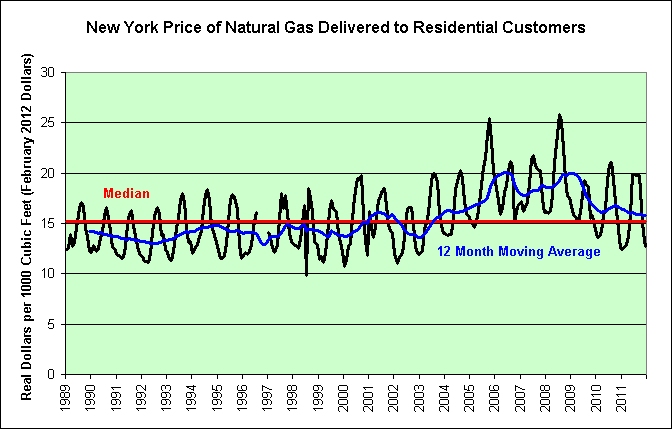
In the chart above I have adjusted the New York price of natural gas delivered to residential customers for the modest inflation as seen in the consumer price index. So where is the much promised hyperinflation that so many have warned us about? The 12 month moving average (in blue) is sitting pretty much smack dab on the long-term median (in red).
On a slightly different note, I always find it interesting how those pushing the hyperinflation theme love to collect U.S. dollars. For instance, if you visit Shadow Stats, you can buy a subscription for a fee – in U.S. dollars. Now, a hyperinflationist would argue that it's using those dollars to buy hard commodities so that’s a valid point, but the problem is that there are no signs of hyperinflation in the Shadow Stats subscription service. In fact, in real terms, the subscriptions are deflating. If one goes back and reviews the cost of the service, it has remained remarkably stable in price:
Brilliant! I love his analysis and the thought process that went into it. Seriously. The article is well worth a read in its entirety.
And as a side note, consider this blog. I don't charge a single penny for people to read what I write (you may get what you pay for though, lol). I also make you this solemn promise. If I have any say in the matter, which I currently do, this blog will never have advertising on it. I don't want to see it. I assume you don't either. I'm therefore sticking it to my competition in a most deflationary way. In other words, I am working cheaper than a Chinese factory worker and intend to stay that way.
“I want to have as few people touching our products as possible,” said Dan Mishek, managing director of Vista Technologies in Vadnais Heights, Minn. “Everything should be as automated as it can be. We just can’t afford to compete with countries like China on labor costs, especially when workers are getting even more expensive.”
I'm always curious how people find my blog. Many visitors arrive using search engines and the search words often inspire new posts. What drives their curiosity often drives my own.
For example, one person searched for "restaurant automation" and found my blog today. The restaurant industry interests me because I think we might have too many restaurants for what is coming. Automation also interests me because it affects long-term employment. So guess what I'll be searching for today? Restaurant automation!
Last night before I went to bed I saw some traffic coming fromMish's site.
I searched for my blog's name on his main page. There I was listed in his links. Imagine my surprise. He's got about 50,000 regular readers. I've probably got about 10 (no complaints!). For a reason that will remain a mystery, Mish added me to his site. Was it my recent anti-hyperinflationist posts? The world may never know! In any event, thanks Mish.
I'm an introvert. My blog doesn't have all that many hits. Gaining readership was never a priority to me. In fact, I'm not sure I'd enjoy having hundreds of comments left for me every day. As you can probably see, I generally try to reply to everyone who leaves a comment. I enjoy the interaction but that kind of volume would wear me out. In sharp contrast, the current volume is nearly optimal (and the quality of the interaction has been outstanding).
I don't seek out link exchanges (although will generally accept if asked, meaning that I have yet to refuse). If I see a blog that interests me, I'll simply add it. That's how Mish appeared on my blog. Most of the time I agree with what he has to say. Some of the time I'm in wild disagreement. It is almost always interesting and that makes him a must read for me. He definitely doesn't think inside the box.
As a side note, I don't mean to play favorites butMaxedOutMamacomes in a close second and for the exact same reason. If I was trapped on a deserted island and had but two blogs to take with me, those would be the two.
And lastly, I've added a new blog to my links today. I spotted a visitor coming in fromWasatch Economics.
Here's a blast from the past. Keep in mind that it was two months before the great recession began.
My interpretation of these three indexes is that many investors shifted cash from credit markets to equities due to the crunch and now are recognizing that equities will suffer due to economic slowing in the US and the effects of tighter credit on net income for public companies. Also, even though foreign buyers may be reducing their purchases of Treasuries, domestic demand for same has increased due to the desire to shift cash to the least risky investment.
Nicely played. Here's Scott's latest post. Let's hope he's not two for two.
So there I am doing some light reading of thedetailed CPI reportwhen I stumble upon an interesting phenomenon in the 12-month median price changes as seen in Table 1V.
Men's Apparel: 1.99% Women's Apparel: 2.10%
Boys’ Apparel: 5.30% Girls' Apparel: 3.13%
Everything seems to make sense. Even in tough economic times, parents still love their kids. Might make their children's clothes a priority over their own. Right?
So explain this?
Infants’ and Toddlers’ Apparel: -1.89%
I'm pretty sure that parents love their infants and toddlers at least as much as they love their boys and girls. Right? So that got me thinking.
My first thought was that there were a lot of naked infants and toddlers running around, lol. Unfortunately, that has probably always been true and therefore does not explain the phenomenon.
So my next thought was perhaps there were an unexpectedly fewer number of infants and toddlers. You'd certainly get some deflation that way. Picture a store that thinks 100 parents will visit and only 90 actually do. Hello clearance table.
So I now had a theory and it goes well with something I wrote previously aboutdeclining population growth. It was time to go looking for confirmation. It certainly didn't take long to find.
The number of children born in the U.S. has plunged 8 percent since its all-time high in 2007, according to the National Center for Health Statistics. More alarming: population growth is at its slowest growth rate since the Great Depression, according to the U.S. Census.
I'm going to suggest that underemployed workers might tend to think twice about having children. Since both men and women now work, it might only take one of the two being underemployed. The math therefore makes it even worse than it might otherwise appear. Consider the following table.
See the potential problem? Not much of the table is green.
What if it takes two employed breadwinners to both buy a dream home *and* have children?
What if high unemployment and/or skyrocketing tuition costs cause one of those two things to be postponed (or worse, cancelled)?
What if the epic housing bust and high gasoline prices permanently damage confidence?
It isn’t easy to raise children in Japan, where the birth rate of 1.37 children per woman has fallen well below the replacement level of 2.07 and contributed to structural problems facing the world’s fastest-aging society. The reasons cited are myriad: the cost of schooling, a lack of daycare options and an increasing number of women unwilling to interrupt or forego their careers among them.
How are we going to hyperinflate if we can't even get aluminum prices to rise much faster than the modest increases in the consumer price index?
Click to enlarge.
On the other hand, if the world wishes to continue to hyperinflate gold, I'm fine with that. Just count me out. I have no need for gold personally. Even the gold crowns in my mouth no longer exist.Hedonicallyspeaking, they were substituted.
Gold trades at $1,823.20 per troy ounce. Aluminum trades at $1.0376 per pound. There are 14.5833333 troy ounces in a pound. The current gold to aluminum price ratio is therefore a whopping 25,625 to 1.
...
Selling just 5.74 pounds of gold will now allow you to buy all the aluminum needed to make a 747-400.
Gold now trades at $1,662.10 per troy ounce. Aluminum trades at $0.9594 per pound. The current gold to aluminum price ratio is still a whopping 25,264 to 1.
Gold finally appears to be losing some exponential growth momentum compared to aluminum (in addition to its 9% price drop since the last update 7 months ago). It now takes 5.82 pounds of gold to buy all the aluminum needed to make a 747-400.
I owned gold from 2004 to 2006. It treated me well. I have absolutely no desire to own it at anywhere near these prices. I do have an aluminum foil hoard though. Heck, why not? If you look close, it is just to the left of the garbage bags. I may need to buy more foil in 30 years, so keep that in mind if you are planning to invest in Alcoa, lol. Sigh.
As a side note, the petroleum based garbage bags are now up about 30%. Everything else in the picture is inflating modestly. I have no complaints. As silly as this picture looks in a low inflation environment, it has still outperformed buried cash, treasury bills, and savings accounts. What more could I ask of a relatively risk-free investment?
The reason for the aggressive recommendation, as distinct from an early call, is based on the belief (as alarming as it may sound at this juncture) that the yield curve has started to price in, expressly or implicitly, some element of US government risk. Professional arbitrage players have already started to redefine the risk-free rate concept, given that 5-year CDS spreads on securities issued by the US government have widened to 48-55 basis points since late last month. These spreads are only headed in one direction, i.e. the 60-80 bps range, as the socialization of banks, insurers and auto makers will lead to increasing uncertainty on the quality of America’s credit 3-5 years into the future.
Disclosure: Author owns positions in TBT, QID
It is 3-5 years into the future. Let's see how he's done.
TBTAdjusted Close (11/17/08): 60.09 TBT Adjusted Close (3/27/12): 20.05 Net Loss: 66.6%
Hey, it could always be worse.
QIDAdjusted Close (11/17/08): 350.74 QID Adjusted Close (3/27/12): 29.71 Net Loss: 91.5%
I'll believe that when I see it. In 2014, I plan to revisit this post. Wish me luck. I should warn you that I might not be able to afford the electricity to fire up my computer though, lol.
While households have reduced their leverage, government debt has ballooned on the back of stimulus programs, but, argued Schiff, the government’s debt is the people’s debt, thus overall leverage has actually increased.
Wrong. In the following chart I'm showing real total credit market debt owed per capita (February 2012 dollars).
Click to enlarge.
Does that really look like overall leverage has increased? I'm bearish but this is actually the one glimmer of long-term hope that I can still cling to.
Don't believe the inflation figures? Okay, fine. Here's the total credit market debt owed divided by wage and salary disbursements.
Click to enlarge.
It is a nearly identical story.
This is not the first time that Peter Schiff has made bond predictions, so let's go back in time to see what was said.
If foreigners are selling their dollars, why are they simultaneously buying dollar denominated bonds?
Who are the foreigners selling their dollars to? Other foreigners. And what do those other foreigners do with those dollars? Stuff them in mattresses? Hardly. They stuff them in our bond market, just like I do. And why is that? Because foreigners realize that it is better to earn some interest than no interest.
Instead of trying to solve the mystery, bond investors would be well advised to sell now (not just their bonds but their dollars too) and ask questions later.
Note that interest rates have fallen a whopping 2-3% since he told us what was really going on with bonds. Like me, he saw the housing bubble coming and yet couldn't figure out why people might buy bonds?
Click to enlarge.
The blue line shows the 10-year treasury yield without inflation protection. The red line shows the 10-year treasury with inflation protection (TIPS).
The stagflationists who bought TIPS, gold, or oil did fine. The deflationists who bought nominal treasuries did fine.
So what's the common theme? It's what you get when you combine the deflationary Great Depression with the stagflationary 1970s. In my opinion, that's what's really going on with bonds and it has been going on for more than a decade.
It must be driving Peter Schiff crazy. In 2006, he said, "The fuse is lit; we just do not know its length." He now seems to know the length. Well, good for him. I should point out that he is not the first to make such a bold prediction though.
By March of 2012, annualized CPI will cross the hyperinflationary tipping point of 15%.
It would seem that we're running a bit behind schedule. Let theponingcontinue.
And for you CPI conspiracy theorists, note the inflation seen inMIT's Billion Prices Project. (It is very similar to the official numbers. I track every penny I spend and it is very similar to what I am seeing too.)
Now this Asian nation is the third-largest buyer of U.S. exports, ranking behind only U.S. neighbors and free-trade partners Canada and Mexico.
Surprised to hear that it’s China?
I'm actually surprised that the percentage wasn't mentioned. 18.6% of our exports go to Canada. 14.6% of our exports go to Mexico.A mere 7.1% of our exports go to China. Meanwhile, 18.7% of our imports come from China. Surprise!
Alaska, for example, sold $1.4 billion of exports to China last year, more than to any other country, with the largest portion of that being seafood, followed by minerals and forestry products, the council says. Oregon sold $1.6 billion of electronics and computers to China, also its largest export market. Washington sold $4 billion in transportation equipment to China, its most important market. And the state of Texas sold $3.9 billion of chemicals to China, its third-most-important market, behind Mexico and Canada. (Overall, agricultural products, chemicals, computers and electronics, and transportation equipment are what China buys most frequently, the council says.)
I'm surprised yet again. The only mention of the whopping$10.4 billion in 2011 soybean exportsis somewhat found within the parentheses (as agricultural products). Why is our top export to China hidden away like that? We sold less than $1 billion as recently as 2002. What a fantastic growth story that is. Oh my, look at those soybean prices.They've tripledsince 2002. So here's the question of the day. How much of that $10.4 billion is just inflation? Surprise!
And let's not forget copper. That's another $4.3 billion. It was only $305 million in 2002. Growth, baby. Pure growth. Dare I point out what copper prices have done since 2002? Yes, I dare.They've quintupled! Surprise!
And since we are really getting into the spirit of fun surprises, we exported $0 of this item in 2009. We exported $0 of this item in 2010. We exported $264,000 of it in 2011. It might not seem like much, but just think of the growth rate!
So what is that item? You have one minute to ponder the question.
Military apparel and footwear!
We're actually shipping apparel to China. Surprise! We haven't had a Chinese military apparel and footwear export year like that one since 2007. Hey, is the biggest surprise yet to come?Perhaps someone knows something that we don't, lol. Sigh.
I don't mean to imply that it is all bad news. We did export $6.4 billion in civilian aircraft, engines, equipment, and parts. Once they figure out how it all works they'll probably make their own planes in factories that once made cheap American toys, but hey, that could be a long, long time from now.
The J-20's development is also moving along much faster than anyone had expected. Back in 2009, Gen. He Weirong, deputy commander of the People’s Liberation Army Air Force said in a TV interview that the J-20 wouldn't be operational until 2017-2019. That estimate will likely be revised if work continues at the current pace.
This is a thought experiment, so take it with a grain of salt.
Click to enlarge.
Here is the explanation of the "what if" chart.
The chart shows what the interest payments on the real total credit market debt owed per capita (February 2012 dollars) would be *if* the interest rate on all of that debt was equal to the fed funds rate. Anyone with a credit card knows that's not the case, but bear with me.
We seem to run into serious problems when the total of this "what if" experiment exceeds $8,000 per capita (adjusted for inflation). Note the recession bars. And for what it is worth, $8,000 per capita does sound painful.
If it is our intention to continuously grow our inflation adjusted debt (as Japan has done) and simultaneously stay below the seemingly dangerous $8,000 per capita threshold, then at least one of the following two things must happen over the long-term.
What would it take to hit the $8,000 threshold right now you might ask? We currently have $173,000 total credit market debt owed per capita. That would mean that a fed funds rate of 4.6% would seemingly cause serious problems ($173,000 x 4.6% = $8,000).
In 1980, we had an inflation adjusted $55,000 total credit market debt owed per capita. That meant that we could handle a fed funds rate of 14.5% before things broke ($55,000 x 14.5% = $8,000).
It took a 15% interest rate to break the economy in the 1980s. Thanks to the miracle of modern financial leverage it probably only takes 5% now. And should we stay on Japan's path, I suspect that it may only take 1% in one more decade.
So what's my point? If you are waiting on the sidelines for interest rates to rise to the stratosphere and make you bloody rich like they did for previous generations, then good luck on that theory. That's not to say that real yields might not pop up again in the short-term. The deflationary event a few years ago did just that. It could happen again. I find it hard to believe that investors will be rewarded by burying paper dollars in their backyards over the long run though.
The following chart shows the historical 10-year treasury yield minus the federal funds rate. The median is gap is 1.07%. As of yesterday, the gap was 2.12%. I'm thinking that Bernanke would really like to see that 10-year yield come down to meet him halfway. That's assuming he wants us all to learn Japanese of course. Will he succeed? You tell me and we'll both know.
This is not investment advice. It is just a thought experiment based loosely on my long standing belief thatreal yields would die. That was before I had the Mundell–Tobin effect epiphanywhich sealed the deal.
To what? 0.62%? See chart below. When is Jeremy Siegel going to figure out that a heavily indebted/leveraged economy cannot tolerate higher interest rates?
Click to enlarge.
Note that the chart above looks like the inverse of the following one.
In my opinion, this is is not a coincidence. Look what happens when we multiply them together.
Click to enlarge.
We must keep the total in that chart down to a reasonable level if we are to have any hope of kicking the can further down the road. If it seemingly worked for Japan, then I guess we think it will work for us too.
In 2000, then-BOJ Governor Masaru Hayami was widely derided for raising rates from zero to 0.25 percent. Pundits called him Japan's answer to Herbert Hoover. Yet Hayami was trying to force Japan Inc. to implement structural reforms. It didn't work and rates returned to zero in March 2001.
As economic growth recovers and real rates rise, the price of Tips will fall leaving Tips investors with large losses in the face of accelerating inflation. - Jeremy Siegel, February 2, 2011
How are we doing on that economic growth recovery theory of his? I would argue not so good. I would also point out that his rising real rate theory isn't doing so well either. 30-year TIPS rates have fallen 0.5% (from 2.1% to 1.6%) since he said that.
As of yesterday, the 30-year TIPS yields0.93%. Interest rates are not rising like he predicted last year. They've fallen dramatically.
Nearly my entire investable net worth has been sitting in long-term TIPS and I-Bond ladders. Contrary to the opinion of Wharton School economics professors, I will not be financially ruined if interest rates rise. I wanted to lock in rates in case they fell and I'm holding to maturity. I root for rising interest rates so that I can reinvest at higher interest rates as my bonds mature. Can stock investors say the same?
Let's find out. Here's a thought experiment.
If 5-year maturity bond prices go down a little bit if interest rates rise evenly across the board (not often the case), 10-year maturity bond prices go down about twice as much as that, and 20-year maturity bond prices go down 4x as much, then what might infinite maturity stocks do? Perhaps there's a Chinese curse that Jeremy Siegel should study.
And lastly, I'm not suggesting that interest rates can't rise. I'm simply saying that our economy cannot tolerate higher interest rates. I'm very bearish on our long-term future. There are plenty of things that our economy can't tolerate. Takehigher oil pricesfor instance.
At a yield of 2.25%, the 10-year U.S. Treasury is a sure loser. Stocks are a safer choice.
I now refer to page 185 of his 1990 fifth edition "A Random Walk Down Wall Street" book, of which I have a copy. I've had it long enough that the pages have turned yellow. It was my favorite investment book, but now I'm really starting to wonder.
Finally, there is the enormous difficulty of translating known information about a stock into an estimate of true value. We have seen that the major determinants of a stock's value concern the extent and duration of its growth path far into the future. Estimating this is extraordinarily difficult, and there is considerable scope for an individual with superior intellect and judgment to turn in a superior performance.
But while I believe in the possibility of superior professional investment performance, I must emphasize that the evidence we have thus far does not support the view that such competence exists; and while I may be excommunicated from some academic sects because of my only lukewarm endorsement of the semi-strong and particularly the strong form of the efficient-market theory, I make no effort to disguise my heresy in the financial church. It is clear that if there are exceptional financial managers, they are very rare. This is a fact of life which both individual and institutional investors have to deal.
He's telling us now that the markets are currently wrong. He has achieved a level of "competence" that is far in excess of that of the markets overall. Bonds are a horrible place to be. Stocks are much safer. He's that "rare" breed of financial manager who actually knows the best place for us to put our money. So much for his efficient-market theory. Put another way, he now believes that the markets are incredibly inefficient right now and that he knows better.
Let's go back to his article telling investors what to do.
A good way to estimate the likely long-run rate of return from common stocks is to add today's dividend yield (around 2%) to the long-run growth of nominal corporate earnings (around 5%).
He is saying that a good way to estimate future returns is to use the rearview mirror. That's the only place the long-run growth of nominal corporate earnings can be found. Right? There are many ways to estimate future growth. The easiest is to use history and hope it repeats. Good luck on that one.
Too many people invest with a rearview mirror.
Agreed, and yet there he is doing it. Why does he assume that the things seen in the rearview mirror will necessarily repeat?
I think it is safe to say that 5-year TIPS are a sure thing loser once inflation is factored in. I agree with him on that. The math does not lie. They have negative real yields. Just because bonds are losers doesn't mean that stocks will be winners though. Since 1980, both bonds and stocks have done amazingly well. It is entirely possible that *neither* do well over the next 30 years.
What will future stock returns be ifthese realitiesfinally catch up to them? I'd sure like to hear his answer for that. I certainly wouldn't claim to know. I can tell you what I suspect though, and it isn't good.
I would bet all that I own that he hasn't factored in any of those realities into his assumptions. And how can I be so sure? He's still looking at the "long-run growth of nominal corporate earnings" as if nothing has changed. Well, I have news for him.Things have changedand I can prove it. He better hope things don't change again or there will be a great many unhappy equity investors.
In my "efficient-market" opinion, this country cannot grow like it once did. I say this somewhat tongue-in-cheek and entirely based on fact. Demographics and debt make a wicked combination.
LOS ANGELES (AP) — "John Carter" is now officially a flop of galactic proportions.
The Walt Disney Co. said Monday that it expects to book a loss of $200 million on the movie in the quarter through March. That ranks it among Hollywood's all-time biggest money-losers.
Naked and surrounded by hostile aliens, John Carter must fight for survival as aliens try to kill him and/or make him eat bugs.
Ratings: 3.2/10 from 717 users
If you missed the John Carter story, don't worry. You can currentlywatch Princess of Mars on Netflixas many times as you can stomach. Truth be known, I lasted roughly 10 minutes. Cast iron! I dare you to last longer, lol.
It is not to be confused with the higher-budget 2012 film John Carter, which is also an adaptation of the novel.
I beg to differ. I'm confusing them right now. I have little interest in seeing either movie. It isn't that I dislike Science Fiction.Alienis my favorite movie of all time. So what bothers me most about John Carter? Oh, I don't know. In this era of modern technology, perhaps we know more about Mars than we did in 1917? Just a thought.
It's all very silly and illogical (Why has humanity devolved into this ridiculous state? Where are the other mutants? This is far enough in the future for human-fish mutations, yet cigarette packs still exist?)
Yes, it really is all that bad. Here's my pet peeve. If all the polar ice melted then how hard would it be to find dry land? Here's what I would do. I'd look out a window ofmy house. There it is! On the off chance that my 525' above sea level house was actually underwater and I was floating in my raft above it, then I would see Mt. Rainier in the distance. I certainly wouldn't need a gasoline-guzzling jet ski to find it.
With my 110 HP engine jet ski I can make around 100 miles on a full 16 gallon tank, with an average speed around 35-40 mph. But if you're planning to go on a long trip, make sure you have gas station along the way...
The Treasury Department auctioned off inflation-protected securities at a negative yield Thursday, reflecting strong demand for U.S. debt...
Strong demand for U.S. debt?Bondmageddonhas been postponed? Nobody could have seen this coming.
...and investors' belief that inflation will rise in the coming years.
I knew there had to be some reason investors were rushing out of the30 year treasury bonds. You know, the ones without inflation insurance.
Just look at those rising yields.
3/23/11: 4.44% 3/23/12: 3.31%
They've risen -1.13% over the last year! And for the record, that's almost identical to what the 30 Year TIPS have done.
Maybe there is something wrong with the theory about what investors believe. Does a fire insurance theory work the same as this inflation insurance theory? Since it is an analogy, let's call itverbal reasoning and find out.
There is a strong demand for fire insurance in this country. Right? It can mean only one thing then. Most homeowners believe that their homes will burn in the coming years.
Holy crap! There's pretty much only one way this could happen. Global warming is going to turn into global burning! Move your children to safety! Don't wait for the authorities to tell you.
The world will burn and everyone knows it. I have all the proof I need. Too many people have fire insurance. It is the only logical explanation.
Therefore shall her plagues come in one day, death, and mourning, and famine; and she shall be utterly burned with fire: for strong is the Lord God who judgeth her. - Revelation 18:8
365 degrees, burning down the houses.
In all seriousness, why do I even bother to read the news? Oh wait, now I remember. It makes good sarcasm fodder, lol. Sigh.
In the following chart I take the annual nonfarm payroll growth and subtract the annual population growth.
Click to enlarge.
I offer two trend lines based on the behavior change in August 1982. Why August 1982? Through trial and error, that's seemingly the point that best allows the two trend lines to meet up in the middle. It was during theearly 1980s recession and therefore offers a bit of centering balance to the chart.
This is not just a cyclical problem. It's been with us for 30 years. Keep in mind that the red trend line began its life during a severe recession. Could I have made the hurdle any lower? Think about it for a minute. If I told you that my trend line started during a recession and ends during an expansion (like this one does), then would you expect the trend line to slope down? During the next recession (whenever it appears), I expect it to slope down even more (and more closely reveal its true recession to recession slope).
If you are counting on population growth to save us, then I have even more bad news. Check out our population growth trend.
Click to enlarge.
We shouldn't need population growth to become more prosperous. Unfortunately, that would only be true if we weren't relying on an exponential debt ponzi scheme to fund our current standard of living. In other words, we feel the need to borrow from our children to have a more prosperous life today. That's the very basis of my blog's theme. It's an illusion of prosperity.
So let's sum up what these two charts are saying.
Payroll growth is slowing compared to population growth. Population growth is also slowing. That's how you end up with the following chart.
So, other than an economics professor sitting in an ivory tower reciting 200+ years of American history, who in their right mind can possibly think that we can grow like we once did?
Too much debt means too much risk for a generation of young people, many of whom are struggling in today’s economy.
What's one solution for the burden of rising tuition costs, rising food costs, rising energy costs, and high unemployment? Here's the easy one that no doubt works for some people (myself included). Simply stop having children. Be like Japan.
Tokyo (CNN) -- Japan's population will shrink by a staggering 30% by 2060, according to a new estimate by the country's government.
The current population will shrink from the current level of 128 million to 86.74 million, as the graying nation's aging accelerates and the birthrate continues to stay low.
Here's the math behind the black line. You take the monthly product supplied in a given month and multiply it by the WTI spot price of oil for that month. You then adjust that amount for inflation to get it into current dollars. And finally, you add up the results starting in 1981 to get a cumulative total.
Here's the math behind the red line. You take the outstanding federal government debt in a given quarter. You adjust it for inflation to get it into current dollars. That's the real debt. You then subtract off the real debt that we had in starting in 1981. The difference is how much the real debt has grown since 1981.
When looking at the chart, one might think that it is our long-term plan to simply borrow oil. One might think that. Good thing we know better.
"You know, Paul, Reagan proved that deficits don't matter."
"Oil remains fundamentally a government business."
If my blog is mysteriously shut down and I am never heard from again, then please, for the love of all that is holy, do not contact the authorities. It will be too late for me. Save yourself, lol. Sigh.
I had my taxes done today. Every year my tax preparer tries to talk me out of being a bear or at the very least diversify into some assets that can potentially grow. She's really nice about it. It has become somewhat of an ongoing joke. I try to always start with, "Still bearish!"
This year I decided to bring some actual evidence with me. It was my goal to present the bearish case in 5 minutes or less and in 5 charts or less. So here is what I did.
Pretty much had to start with that one. That exponential trend is over and it is fairly easy to prove beyond any reasonable doubt. We clearly cannot cough up 39.3 million jobs when there are *only* 12.8 million unemployed. Right? So put a fork in it. It's over.
Since we can prove that jobs won't grow like they once did, what does that imply about debt growth?
Although we do not have proof, I'd suggest getting out another fork. After looking at the chart, she asked me why we were continuing to expand our ports. I simply shrugged my shoulders and said that the data doesn't appear to support it.
So now let us take that information and think about real GDP growth. Real GDP growth clearly cannot grow like it once did if the previous 3 charts have any merit.
I would bet all that I own that we will never return to the red trend line. Does that make it fork worthy? You tell me. I'm certainly not willing to risk it with my nest egg. Let's just put it that way.
So what could one invest in if real GDP growth were to permanently slow (or worse)? I chose treasury inflation protected securities. I wanted to lock in a real yield in the face of falling real growth. And on that note, I present you with the final chart updated today.
Click to enlarge.
I told her that unlike Jeremy Siegel in February 2011, I did not believe that our economy could support high real interest rates. I backed up the truck while he was warning investors to stay away. I also told her that if I am financially ruined (possible) by owning TIPS, then I won't be alone. It is our debt that's propping everything else up. She said that must give me little comfort. I agreed that it didn't.
She asked me twice if she could keep the charts. One only wonders if she will stare at them as long as I have. I once again felt like the bringer of doom.
Am I though? I wake up every day feeling fortunate that I was born when I was and where I was. I've already lived longer than many people throughout history. Perhaps it isfatalisticway of looking at it, but it is how I feel. Whatever happens, happens. I'm not a religious person but in my opinion there is great wisdom in the following quote.
God, grant me the serenity To accept the things I cannot change, Courage to change the things I can, and wisdom to know the difference.
Brilliant in its simplicity, The Serenity Prayer is one of the key spiritual tools used by virtually all 12-step recovery support group members.
Our economy could certainly use a 12-step recovery program.
I accept that the growth rate of this economy won't be what it once was. I have made every effort to adapt to the new reality. That's really all I can do, and in my opinion that's all our next president will be able to do either (at best).
This is not investment advice. It is not an endorsement to buy long-term TIPS. Heck, I don't know what I would do if I had more money to invest right now. All I can say is that I continue to hold the TIPS and I-Bonds that I do own. It was my plan to hold to maturity and that's exactly what I'm doing. As seen in the last chart, February 2011 was the real buying opportunity, much to the dismay ofJeremy Siegel.
And lastly, my taxes were relatively modest this year. The market appreciation of my TIPS did not show up in my taxes. The IRS doesn't care what the market thinks my TIPS are worth, not unless I sell them anyway. I have no plans to do that. I therefore continue to pay taxes on the modest inflationary gains and the modest interest payments. I have no complaints.