March 30, 2011Restaurateurs Think Yelp, Groupon Are Hurting BusinessMany experts feel that Groupon and the practice of deep discounting, made popular by stingy customers during the 2008-2010 recession, is far more damaging to restaurant brands.
“The ultimate harm is the culmination of all of these group buying coupon programs and restaurants participating in them feed the addiction of coupon clippers, who hop from one restaurant to another,” says Joel Cohen of RestaurantMarketing.com, a leading consulting website for the food service industry. “I’ve definitely heard more horror stories than success stories.”In my opinion, Groupon.com is to the restaurant industry what Amazon.com is to the strip mall industry.
February 13, 2011The future of the strip mall: downhillToday, the nation’s “healthiest” retailer is not Wal-Mart or Costco. It is Amazon. Amazon has exploited the increasing availability of broadband Internet and mobile technology to build a retail superpower. One of the biggest reasons why the strip is coming to an end is because bricks-and-mortar stores are becoming a smaller part of the retail landscape.December 1, 2010Groupon May Be Fastest-Growing Company EverGroupon, an Internet coupon start-up that is reportedly a Google takeout target, may be the fastest growing company in history.
I'm talking the candy, not necessarily the stock.
March 30, 2011Hershey to raise candy prices nearly 10 percentThe candy maker says the price increase takes effect immediately.
Consumers may not see the impact on store shelves right away, because many retailers will be able to buy products at the old prices for about eight weeks.That's an instant 10% return on investment for those who love candy. It won't make you wealthier though. Sorry.
Here's the good news. You won't pay tax on the capital gains. You can simply eat your inflationary profits.
 Click to enlarge.The annual inflation rate as seen in the CPI is shown in black. The average annual inflation rate over the previous 20 years is shown in red. The expected inflation rate over the next 20 years is shown in blue (as seen by comparing the yields in inflation protected treasuries to the yields in treasuries without inflation protection).I turned bearish in the fall of 2004. I could not predict what inflation would do then and I cannot predict what inflation will do now. I have seen above average inflation and I have seen below average inflation since I turned bearish. It has been a roller coaster ride. Here's the interesting part to me. Inflation has averaged 2.4% per year since then. That's roughly 1/3rd of this chart.I don't have many reasons to suspect that the bond market's prediction of 2.7% inflation per year over the next 20 years is necessarily wrong. It is simply predicting more of the same.Just something to think about if you are content earning 0.10% in three month treasury bills awaiting the next deflationary crash. It is also something to think about if you have loaded up on risky assets by assuming far greater inflation in the future.
There are alternatives. 20-year TIPS still pay 1.61% over inflation. I can't say they are 100% safe, but they do protect against the slow grind of inflation if held until maturity. In fact, they are ideal for protecting against the slow grind of inflation. Unlike what most financial experts preach, higher inflation does not help those who own inflation protected treasuries. It only hurts (due to the taxation on the gains).
This is not investment advice.
Macke’s Purple Crayon: Watch the Trendlines on S&P, Crude and GoldCharts take out the emotion. A chart doesn't pass judgment or make fun of you. A chart just tells you when the trend has turned against your position. Never fighting the trend is the first thing you learn in trader school. Someday gold's trend will turn lower. When it does, I'll sell.
It doesn't matter if you're talking about a relationship, a fist fight or a trade. You can attempt anything you want as long as you have an exit plan. When I'm playing momentum my exit plan never changes -- when the trend changes, I sell.
In an uncertain world, the old reliable purple crayon method is a security blanket, a hug from mom and warm cocoa all wrapped into one line and a ruler. That makes following my purple crayon strategy the best value on Wall Street.
Disclosures: Macke is long GLD.PurpleThe imperial robes of Roman emperors were Tyrian purple trimmed in metallic gold thread. The badge of office of a Roman Senator was a stripe of Tyrian purple on their white toga. Tyrian purple was continued in use by the emperors of the Eastern Roman Empire until its final collapse in 1453.The Evolution of Crayon ColorsI wonder why, during the Great Depression, Crayola decided to double the number of colors. Seems like an odd time to innovate, due to higher costs, but definitely a morale booster during economic times, at least for those who could afford crayons. I wonder if the box of 16 became a status symbol.One purple crayon is all it takes to attain wealth beyond all measure these days. No thinking. No analysis. If you can draw a straight line then prosperity is yours for the taking.Crayola Crayons - Invention of CrayonsDuring the Great Depression, Binney & Smith hires local farm families to hand-label crayons. Each farm becomes associated with a different color name.Thanks to the advancement of computer processing power, Wall Street's trading farms can now sell a nearly infinite supply of purple trend lines at amazingly low prices. You'd be a fool to not take advantage of their special offer.
Who knows, you might even become the trend line master.January 6, 20070:55 - 1:32:It would be sweet if they had like this game called Trend Line Master. Everyone logged in and then they'd try to draw trend lines on these charts and you competed with other people and whoever drew the best trend lines was like the trend line master.
And I've been drawing trend lines for, you know, years so I think, I think I'd have a reasonably good chance of becoming the trend line master.
So I've been loading up on these Chinese stocks the last few days. Those Chinese stocks, man, that's one thing that never goes down. Chinese stocks.See Also:Trend Line Disclaimer
It may be a while before I post in earnest again. It was very fun, but I'm now in cool down mode.Activity Highlights for the Week1. Music Experience Project2. Space Needle3. Argosy Cruise4. Woodland Park Zoo5. Seattle Aquarium6. Pacific Science Center7. Snoqualmie Summit Snow Tubing8. Olympic National Rain Forest9. Pacific Ocean10. Fisherman's Terminal11. Umpteen Hundred Trips to Starbucks ;)There was a Battlestar Galactica exhibit within the Music Experience Project and a Star Wars exhibit within the Pacific Science Center. We also drove through the city of Forks to appease the Twilight fans.Over the course of 6 days we drove 600+ miles, took four trips by monorail, one trip by ferry, and maybe walked 60 miles on foot (based on 10 miles per day).My girlfriend's sister's husband even managed to work in 27 holes of golf in addition to the 6,000+ miles of airline travel it took them just to get here and back.What a week!
Here's a glimpse of what I look like right now. ;)
My girlfriend's sister and her family will be staying with us for the next week. I therefore probably won't be posting much.Murphy's Law of Cleaning Math19 1/2 hours ago I told my girlfriend that there were 20 hours left before we needed to leave for the airport. I asked her how much time it would take us to get the house ready for their arrival. She said 10 hours. I said that it would probably take 20 hours then.There are 30 minutes left and we have about "15" minutes of work to do. Perfect! Hahaha!"No sleep for you!"
Don't forget to mark it on your calendars.New York Times Online Subscription Service Launching March 28The New York Times on Thursday unveiled details about its long-awaited paywall, a digital subscription service that will cost between $15 and $35 per month, depending on your level of service.I can't speak for you of course, but it will be the last day I stop reading the New York Times. It will be quite a milestone.For those who don't want to subscribe, the Times will offer 20 free articles per month...Okay, okay. That's not quite true. I might accidentally read something there, but that 21st time each month is going to annoy the @#$% out of me, lol.Update:Speaking of annyoing the @#$% out of me, check this out.NY Times risks losing readers with new pay modelIt will charge $15 per month, or 4 weeks...Since when are 4 weeks considered to be a month? Last time I checked there were not 13 months in a year.
I added a poll so that you could vote on how much I should pay for online content. Be sure to vote! Hahaha!
Google Trends: Stagflation Click to enlarge.If you haven't found the exits by the time this chart starts spiking again, then heaven help you. It is just a theory of course.
It's like watching a ticking time bomb. I would bet all that I own that it will explode someday. There will be an interest in "stagflation" again. I just can't say when or whether it will even be in my lifetime.
The outcome probably won't be stagflation though. By the time everyone is talking about it we'll be heading right back into deflation. There's just no way "everyone" can be on the right side of the trade.
That said, one has to wonder why $100 oil isn't enough? See that "B" on the chart? That's Greenspan telling us that he saw early signs of stagflation. It was the very month we slipped into a recession.December 17, 2007Greenspan Sees Early Signs of U.S. Stagflation(Reuters) - The U.S. economy is showing early signs of stagflation as growth threatens to stall while food and energy prices soar, former U.S. Federal Reserve Chairman Alan Greenspan said on Sunday.That's not the best quote though. Check this one out."It's only when the markets are perceived to have exhausted themselves on the downside that they turn," he said. "Trying to prevent them from going down just merely prolongs the agony."That's just priceless.Google Trends Terms of UseYou may use Google Trends for your own internal purposes and for educational and research purposes.That is certainly my intent!
March 16, 2011Accenture targets 25,000 employees in PhlIn this afternoon's interview with Philstar.com, Keith Haviland, global delivery lead of Accenture's Technology growth platform, said the company is aggressive in advancing its talents in software development and applications management such as SAP and Oracle-based careers and many other jobs requiring high-end skills.They'll no doubt be doing the jobs Americans don't want.You've got to Accenturate the Philippines
Eliminate Americans
And latch on to opportunities
Don't mess with Mr. Charlie Sheen
You've got to cut pay down to the minimum
Bring gloom up to the maximum
Have faith in pandemonium
Outsourcing really makes us bleedThis post inspired by mab.
This was sent to me in an email. Enjoy! :)
But for how long? Wouldn't it be nice to know?
The following chart shows the PPI for all commodities divided by the CPI. Click to enlarge.Check out the peaks.
It peaked in 1917.
It peaked 34 years later in 1951.
It peaked 29 years later in 1980.
It has been 32 years since the last peak.
Just something to think about if you are still hoarding hard assets at prices well above their inflation adjusted long-term averages. If this chart has any merit, then there could easily be a few years left though. They might even be the juiciest years. Who can really say?
I should point out that technically speaking the peak in the 1970s was in late 1974. 1980 makes more sense to me as the true peak of that era though. I took some artistic liberty with that data point.
I lean deflationary but I still prefer to own Treasuries with inflation protection. I recently went pretty much all in. I can't say it has been a bad plan for the past two months. The seasonally adjusted CPI-U has risen 0.95%.
Anyone watching the Billion Prices Project could see that inflation was running hot.
March 1, 2011
February's Real-Time Inflation Running Hot
Note the big jump in February. Some of this should trickle into February's CPI report due to be released on March 17th.
March looks to be running hot as well. Yikes.
And lastly, I want to point out something disturbing in the latest CPI report. Look at the last two months.
Consumer Price Index Summary
Food at home: 0.7% + 0.8% = 1.5%
Food away from home: 0.2% + 0.2% = 0.4%
That tells me that restaurants (a vital part of our service economy) have very little pricing power. Now might not be the best time in recorded history to be opening a new restaurant.
March 16, 2011
Restaurant Chains See Growth Despite Economy
The top 500 largest chain restaurants in the United States all showed growth in sales during 2010, with an average annual rise of 1.8%.
The CPI-U is up 2.1% year over year. How can 1.8% be considered growth?
Source Data:
St. Louis Fed: PPI: All Commodities
St. Louis Fed: CPI-U
 Click to enlarge.Note that the downward trend is starting to level off.The following chart shows the percentage drop from the peak value and compares that to the aftermath of our last recession. I've included 6 month moving averages as an attempt to detect the inflection point. In other words, I'd like to know when we might expect to see the unemployed per job opening begin to rise again.
 Click to enlarge.The chart is far from encouraging. Note how the trend in orange is pulling away from the trend in red.Source Data:St. Louis Fed: Job Openings: Total NonfarmSt. Louis Fed: Unemployed
March 14, 2011As Japan seeks to finance reconstruction, U.S. debt costs could riseNow, as it begins the costly process of rebuilding, Japan will almost certainly be buying less Treasury debt and other foreign assets. That in turn could push the United States to pay higher rates on its securities to attract new buyers, eventually putting upward pressure on other U.S. interest rates — including what American consumers pay for credit.I'm not a believer in the theory. The bond market isn't either apparently.
 The natural disaster in Japan has created no discernible impact on US interest rates or US inflation expectations. Look at the rates last Friday. Compare to today's rates. The transition was as smooth as a baby's bottom. Surely if there was money to be made on betting that interest rates would rise due to the earthquake and tsunami, then high-frequency trading programs would be making heavily leveraged bets on it by now. There would be no smooth transition. We definitely saw this effect as investors rushed to sell Japanese stocks today.Here's the problem with the theory. If Japan sells US Treasuries to raise US Dollars, uses those US Dollars to rebuild its country, then someone else will be stuck with those US Dollars. What is that someone going to do?Which makes more sense?1. Bury the US Dollars in a secret vault and hope they maintain their value.2. Buy US Treasuries so that they will earn at least some interest.
Perhaps you are thinking that they will decide to spend those dollars on something else instead. Okay, fine. Now the next someone is stuck with US Dollars, and so on, and so on. Eventually those US Dollars will stumble into the hands of someone who will buy US Treasuries though.
I am not concerned about rising real yields on my long-term inflation protected Treasuries. If anything, I am worried about even lower real yields in the future. The potential to increase purchasing power by investing in relatively safe Treasuries has been declining for a decade. In my opinion, this is no longer the era of making money off of money. That party ended.
Just opinions of course.Source Data:Daily Treasury Yield Curve RatesDaily Treasury Real Yield Curve Rates
March 14, 2011Japan Earthquake: Third Reactor at Fukushima Nuclear Plant ExplodesA new explosion at a Fukushima Daiichi nuclear plant reactor in Japan early Tuesday may have left the reactor leaking water, according to the company that runs the plant.March 14, 2011A Tribute to the Japanese PeopleThere is no panic, there is no fighting for scarce food and water, there is no looting.You are probably wondering who I quoted in my headline. Let's just say that I am not proud to be living in the Seattle area today. Check out my local news.March 14, 2011Japan disaster leads to nuke pill demand in SeattleAnd even though experts have repeatedly said there is no current threat of a nuclear release reaching the U.S., a holistic nutrition store on Seattle’s Capitol Hill had its modest supply of potassium iodide sold out in hours.
“Oh yeah, they’re really scared,” said Rae Diamond of Rainbow Natural Remedies, “and that’s the main thing…to try to quiet the fears.”Seattle to Fukushima AirportThe straight line distance between Seattle and Fukushima Airport is approximately 4683 miles or 7537 kilometers.Unbelievable.
Potassium iodide is about as useful at protecting us from nuclear disasters 4,683 miles away as 14mg gold coins are useful at protecting us from economic disasters here at home. At least we are consistent apparently.
Dai Senryaku Exceed 7: Modern Military TacticsPrice: $1.50 (+$3.99 shipping)If you are a fan of deep strategy games and you still own a Playstation 2 then how can you possibly go wrong buying this game? Check out that deflationary price.It was the last game I bought before upgrading the the PS3. I was up all night playing it yet again. The graphics are simple but the game play more than makes up for it.It is not a game that everyone will enjoy. You either like strategy games or you don't. If you do like strategy games, then you should love this one. Here are two reviews that I agree with wholeheartedly.December 30, 2007The best strategy game for the Playstation 2All in all, if you're not afraid to sink your teeth into a rich and rewarding strategy game experience then Dai Senryaku will not disappoint.February 7, 2010We need a PS3 version ASAP!!!!!The sheer depth and fun of this game defies the current notion the western market has that turn-based games are dated or obsolete.Here's a bonus review that would differ from my own.January 21, 2008Dated strategy gameOriginally appearing back in 2005 on the XBox, Dai Senryaku VII is a strategy game that is incredibly deep and surprisingly rewarding once you get the hang of it, but the game's very bland presentation is what really hurts the game.If a game is incredibly deep and surprisingly rewarding, then I am tempted to enjoy it regardless of the presentation. Maybe that's just me though! ;)
 Click to enlarge.The data is a pretty good fit so I've extrapolated the trends backwards in time 5 years to cover the full range of the chart.I'd like to take a moment to discuss how the short-term can appear fairly wild without actually being all that wild.Picture your friend asks you to loan him $10.01 and he pays you back $10 one hour later. He then asks if you want that penny too and you tell him it is close enough. So how much would you have left if you did this every hour for an entire year? Here's the math.(($10.00 / $10.01)^(24 * 365.25)) * $10.00 = $0.0016You'd have about 1/6th of a penny left of your original $10. Behold the power of negative compound interest.As seen in the next chart, short-term duration T-Bills do not pay the negative interest rates that the long-term trends would imply.
 In my opinion, this logarithmic model breaks down due to the 0% floor. I think Ben Bernanke would set interest rates negative to match the model if he could though. Another way to put this is that the performance of buried cash is doing much better than Ben Bernanke would prefer. Should we slide back into deflation that would be especially true. Just something to think about.As a side note, this chart reminds me a bit of my experiences at the horse races. The favorite (cash?) generally did not lose you money. If the races were even remotely rigged, the longshots (long-term bonds?) paid well. The worst bets were therefore what was left. Over the long-term, too many people betting on near favorites caused these horses to pay less than they deserved. Perhaps we are seeing that same effect in the 2-3 year Treasuries. I think they might be too popular for their own good. Note how far below the logarithmic trend line they are.
Please do not consider this to be investment advice. I don't own any Treasuries that don't offer inflation protection. My *bet* is on both the favorite (at least some long-term inflation) and the longshot (long-term TIPS held to maturity) simultaneously.Daily Treasury Yield Curve RatesNegative Yields and Nominal Constant Maturity Treasury Series Rates (CMTs). Current financial market conditions, in conjunction with extraordinary low levels of interest rates, have resulted in negative yields for some Treasury securities trading in the secondary market. Negative yields for Treasury securities most often reflect highly technical factors in Treasury markets related to the cash and repurchase agreement markets, and are at times unrelated to the time value of money.
As such, Treasury will restrict the use of negative input yields for securities used in deriving interest rates for the Treasury nominal Constant Maturity Treasury series (CMTs). Any CMT input points with negative yields will be reset to zero percent prior to use as inputs in the CMT derivation. This decision is consistent with Treasury not accepting negative yields in Treasury nominal security auctions.The U.S. Treasury does not have a similar disclaimer for TIPS. Although I have yet to see an initial auction with a negative interest rate, I have seen a reopening of an auction have one.October 25, 2010TREASURY AUCTION RESULTS (5-Year TIPS)High Yield: -0.550%Technically speaking, the actual bonds still pay a positive interest rate of 0.5% (above and beyond the inflation rate). Investors simply bid them up.TREASURY MARKETABLE SECURITIES TENDER INSTRUCTIONSNote About TIPS: Should the accepted auction yield be 0% or less, the security will not have regular semiannual interest payments. The yield will be adjusted for inflation throughout its lifetime, thus posting changes at maturity (or sale). In this case, where the accepted auction yield is 0% or less, the interest rate will automatically be set at 0% (never anything lower) for all buyers.Based on those tender instructions and the Treasury's comments about negative yields on nominal bonds, I'd be somewhat surprised if the 5-year TIPS yield is below 0% during the next initial auction on April 21, 2011. I could be reading this wrong, but 0% does seem to be the floor during an initial auction. I suppose it is possible that the bonds can have a 0% floor in an initial auction but you still need to pay a premium to get that rate. It seems unlikely to me though.
All I really know for sure is that I-Bonds do have a 0% floor and you will never need to pay a premium to get that rate. I-Bonds are therefore clearly a better choice than negative yielding TIPS for those planning to hold at least 5 years.
I have no "interest" in owning bonds that are virtually guaranteed to pay negative real interest rates. I'd much rather sit out at the longer durations and hold until maturity than be stuck accepting horrible short-term returns on the hopes that they don't stay permanently horrible.
This clearly isn't an option for everyone though. If you need the liquidity, you need the liquidity. Picture the older retired saver living on fixed income who can't afford to take the interest rate risk of holding long-term TIPS. He/she is the very person our monetary policy is targeting. It is such a sham(e).Update: I'd be a buyer of Ice Age bonds. I don't even care if I get paid back at maturity. A real yield of 10% or more would make one heck of a long-term annuity. Just throwing the idea out there on the off chance Ben Bernanke truly does want Americans to save more.The United States must increase its national saving rate. - Ben Bernanke, October 19, 2009Source Data:Daily Treasury Yield Curve RatesDaily Treasury Real Yield Curve Rates
March 10, 2011Organic Crops Alone Can't Feed the WorldGiven these figures, a switch to organic agriculture would require a 43 percent increase over current U.S. cropland...He's such a doom and gloomer. Organic crops can feed the world someday if we all follow Japan's lead.February 25, 2011Japan population growth rate slows to record lowThe decreasing growth rate is a headache for Japan, which has a shrinking pool of taxable citizens and ballooning social welfare costs to care for an increasing number of elderly.
Slowing population growth also means that Japan, already the most indebted industrial nation with public debt double its $5 trillion economy, will find it increasingly difficult to spread its debt burden.Win win.January 6, 2006Population size 'green priority'Writing for the BBC News website, he says population is the "Cinderella" issue of the environmental movement.Bill Gates: CO2 = P x S x E x CGuess what the "P" represents.
 It doesn't take a lot to move long-term TIPS prices. In the grand (ponzi) scheme of things, there just aren't that many. Our country is borrowing well over a trillion dollars per year right now. $15 billion is a drop in the bucket.This is currently working out in my favor. I was a participant in the last 30-year TIPS auction ($9 billion offered in 2011's first TIPS auction). The rate has fallen from 2.19% that day to just 1.89% today.Who knows what the long-term has in store? I can say that I would not be comfortable owning 92% of the bonds in this pie chart for the full 30 years.I continue to lean deflationary in the short-term. I don't lean deflationary in spite of $100 oil though. I lean deflationary because of it. I expect something to break again.
That said, I am braced for slow growth and/or inflation over the long-term. I've been braced this way for 6 1/2 years and I see little evidence to suggest that I should change my opinion. Hindsight isn't exactly beating me up all that much, at least so far. There was definitely a growth problem and there has definitely been at least some inflation (the CPI is up about 17% since I turned bearish in 2004). Win win. Sigh.Source Data:2010 Auction Results: TIPS2010 Auction Results: 30-year Bonds
The following chart shows the seasonally adjusted annual rate of federal government receipts per capita. It is adjusted for inflation (in January 2011 dollars). Two bubbles down. Who knows how many left to go?This post inspired by Jazzbumpa from the comments.
Update:
Mr Slippery requested a chart showing government expenditures using the same methodology (also per capita and adjusted for inflation). Cyclical problems can be solved with cyclical solutions (deficit spending) but structural problems require structural solutions. Over the long-term, we cannot continue to grow government spending without also growing government receipts. The longer it takes us to realize this the bigger our problems will be.Source Data:St. Louis Fed: Federal Government Current ReceiptsSt. Louis Fed: Current ExpendituresSt. Louis Fed: PopulationSt. Louis Fed: CPI-U
 Click to enlarge.Here's a simple explanation of the x-axis. A country that only exports would be seen as 100% in the chart. A country that only imports would be seen as -100% in the chart. A country with balanced trade would be seen as 0% in the chart.
Note that there is a lot of noise in the data, but the trends do seem valid to me. The higher the trade deficit, the higher the unemployment. I've shown two trend lines. The trend line in red weights all countries equally and the trend line in blue weights all countries by their GDP. The slopes of both trends are consistent.
Also note that a 10% unemployment rate in the United States is entirely consistent with the global weighted linear regression trend line based on our current trade situation. I would argue that unsustainable government deficit spending is the only thing keeping it below that rate.I listed all the countries from the CIA World Factbook that have data for GDP, unemployment, population, exports, and imports. If any country did not have all of that data then it was excluded from the list. For example, Somalia was removed. Perhaps they would simply prefer to pirate.SomaliaSince 1991 no central government has controlled the entirety of the country, despite several attempts to establish a unified central government.Piracy in SomaliaThere have been both positive and negative effects of the pirates' economic success. Local residents have complained that the presence of so many armed men makes them feel insecure, and that their free spending ways cause wild fluctuations in the local exchange rate. Others fault them for excessive consumption of alcoholic beverages and khat.[26]
On the other hand, many other residents appreciate the rejuvenating effect that the pirates' on-shore spending and re-stocking has had on their impoverished towns, a presence which has often provided jobs and opportunity when there were none. Entire hamlets have in the process been transformed into veritable boomtowns, with local shop owners and other residents using their gains to purchase items such as generators -- "allowing full days of electricity, once an unimaginable luxury."Speaking of pirating, the Cayman Islands sure are bucking the trend (as seen in the chart). How do they do it?September 14, 2006Offshore tax shelters not just for the rich• Cayman Islands. United Kingdom territory is home to more than 500 banks and trust companies, 7,100 mutual and hedge funds.And then there is Turkmenistan. What a joy it must be to live there. I would not have even thought to check out what is going on in that country had I not made this chart.February 28, 2011No student protests here, they wouldn’t dare – welcome to TurkmenistanThese measures add to the already restrictive atmosphere in which academia operates. Students at Turkmen colleges and universities are not allowed to appear in foreign media, leave the country on vacation, drive a car, or use mobile phones on university premises. There is of course, little chance of protest within Turkmenistan. This is another right that Turkmen citizens do not enjoy.Source Data:CIA - The World FactbookWeighted Linear Regression Instructions
March 4, 2011Retail jobs are disappearing as shoppers adjust to self-serviceAutomation — long a force in agriculture and manufacturing — is accelerating in the retail sector, a trend that could hamper efforts to bring down the nation's stubbornly high jobless rate.The new employment report is out and the first thing my eye went to was the drop in retail trade. It has really been struggling in recent years.The following chart shows retail trade employment per capita. The retail trade employment bubble is over and there's no going back. The following chart shows retail trade employment as a fraction of nonfarm payrolls. Roughly 1 job out of every 9 jobs is located in this industry and the trend just isn't looking good for workers here.
 BLS: Retail Trade (2009)1. Retail Salespersons: 3,891,3102. Cashiers: 2,828,7303. Stock Clerks and Order Fillers: 1,303,730BLS: Retail SalespersonsDespite the growing popularity of electronic commerce, the impact of online shopping on the employment of retail salespersons is expected to be minimal. Internet sales have not decreased the need for retail salespersons.I strongly disagree. The following chart shows the exponential growth in nonstore retail sales per capita and is adjusted for inflation. It is growing at 5.1% per year in real terms and it is back on trend. I have never spoken to a retail salesperson when making an online purchase.
 BLS: CashiersContinued growth in retail sales is expected, but the rising popularity of purchasing goods online will limit the employment growth of cashiers, although many customers still prefer the traditional method of purchasing goods at stores. Also, the growing use of self-service checkout systems in retail trade, especially at grocery stores, should have an adverse effect on employment of cashiers. These self-checkout systems may outnumber checkouts with cashiers in the future in many establishments. The impact on job growth for cashiers will largely depend on the public's acceptance of this self-service technology.I strongly agree. It would seem the same person did not write both outlooks.BLS: Stock Clerks and Order FillersJob openings in grocery, general merchandise, clothing, and department stores will be greater than in other industries, because much of the work is done manually and is difficult to automate.Innovation starts as a trickle and progress never ends. Just because something is difficult to automate now does not mean that it will always be difficult to automate. In fact, it is already starting to happen.Minimization of manpower requirements
Lowering expenses for stocking of shelvesRobotic Nation by Marshall BrainThe problem is that these systems will also eliminate jobs in massive numbers. In fact, we are about to see a seismic shift in the American workforce. As a nation, we have no way to understand or handle the level of unemployment that we will see in our economy over the next several decades.
These kiosks and self-service systems are the beginning of the robotic revolution. When most people think about robots, they think about independent, autonomous, talking robots like the ones we see in science fiction films. C-3PO and R2-D2 are powerful robotic images that have been around for decades. Robots like these will come into our lives much more quickly than we imagine -- self-service checkout systems are the first primitive signs of the trend.As a former lead software engineer, I believe it. We haven't seen anything yet. In a perfect world, this would create a huge improvement in our standard of living. Too bad we don't live in a perfect world. We live in this one.Source Data:St. Louis Fed: All Employees: Retail TradeSt. Louis Fed: Total Nonfarm Payrolls: All EmployeesMonthly & Annual Retail TradeSt. Louis Fed: PopulationSt. Louis Fed: CPI-U
March 1, 2011Crude RealitiesThe world produces -- and consumes -- about 80 million barrels of crude oil a day. At a $100 a barrel, that amounts to $8 billion dollars or just short of $3 trillion dollars a year. World GDP is about $60 trillion using current dollar exchange rates, and about 20% higher if measured on the basis of purchasing power parity. That means oil consumption is about 4% to 5% of world GDP.Not one thought is spent analyzing how the price of oil affects the remaining 95% to 96% of world GDP. For example, let's say I was thinking about going out to eat and would have enjoyed the very best that our American service economy offered, but the high price of oil made me stay home instead.Yet even if oil prices soar, I would be surprised if stock prices fell by much more than 20%.That's certainly comforting. Let's all make a mental note of that quote for future reference.March 2, 2011Rebound in travel industry threatened by fuel prices"The big trend that is about to hit us is the rise in the price of oil. It is going to underlie everything," travel writer Pauline Frommer predicted in an interview. "That's the dragon looming on the horizon."March 3, 2011Declines in restaurant visits are slowingAs encouraging as the latest stats are for restaurants still coping with the prolonged economic downturn, rising gasoline prices could easily stunt the industry's slow recovery, says NPD analyst Bonnie Riggs.February 24, 2011Spiking Oil Prices: Time To Worry Yet?Different industries are watching closely for those crossing-the-Rubicon price points that spell real trouble.The Rubicon is definitely worth watching. It reminds me of 2008.March 19, 2008Gas prices gouge eating, shopping habits, tooAmericans are paying more at the pump, and that means that they have less money for everything from the cable bill to eating out.Update:March 24, 2008Jeremy Siegel On The Financial CrisisThe deep downward spikes that we used to get, particularly in manufacturing--those suddenly down-and-then-up spikes of unemployment--have given way in a more service-oriented economy, in a slower, much more muted behavior of unemployment and employment and for a little longer.The muted behavior of unemployment in our service-oriented economy was certainly a sight to behold.Since we've talked a couple of weeks ago, the dollar has gone down even further, commodity prices have risen, and oil is now at $110 and going higher. That is my primary concern.Keep in mind that we officially entered the recession in December 2007 (three months earlier) when oil was under $100. $145+ oil was therefore just insult to injury.So, my feeling is that we may not pick up until 2009, although I think that 2008 might surprise us in the second half.The second half of 2008 was quite the shocker. The S&P 500 traded at 1,349.88 when he offered his wisdom. It hit a low of 666.79 on March 6, 2009. For those keeping track at home, that was a 50% loss. So what did he tell investors to do?Don't get scared and sell anything out. This is not going to be a Great Depression. I know that some people are talking about it, but if you see the way the Fed is moving and making sure that liquidity is in the system, and if you look at what is happening in the real economy--and believe it or not, it's still moving along, with very few people, net, having lost their jobs. I think that you will see that there are a lot of reasons for being confident about the future.Oil is $100 again. He's telling investors not to get scared again. Wonderful.
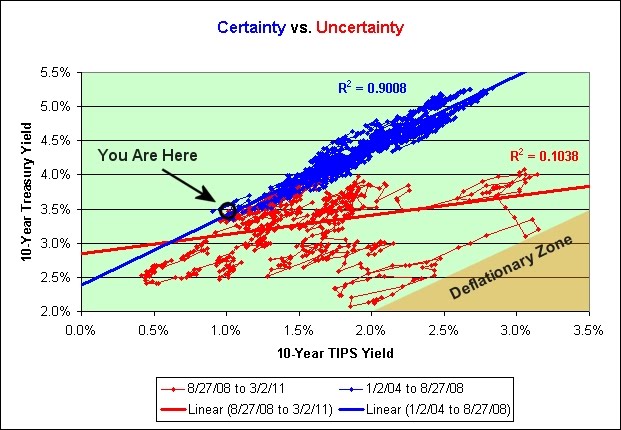
 Click to enlarge.Deflation flattened the "sure thing" blue trend line and added a great deal of uncertainty as seen in the red trend line.Although we are back in the blue zone right now, there's no telling how long we will stay here.Should stagflation appear, I would expect to see the trend line steepen and create additional uncertainty. Although I am braced for this outcome by owning TIPS, I actually lean more towards a deflationary relapse. QE2 is wrapping up soon and there's little talk of additional stimulus. I'm not sure the patient can do well without life support.Readers know that I am no fan of gold at these levels (compared to the price of toilet paper anyway). That said, if gold feeds on uncertainty then there may be much more yet to come.
November 23, 2010George Soros’ and John Paulson’s Biggest Holding Is GOLD“It’s all a question of where are you in that bubble,” Soros, 80, said in a speech at a meeting organized by the Canadian International Council in Toronto on Nov. 15. “The current conditions of actual deflationary pressures and fear of inflation is pretty ideal for gold to rise.”
“The big negative is that too many people know this and a lot of hedge funds are very heavily exposed,” Soros said. “Gold has shown tendencies to go parabolic and usually bubbles tend to end in that parabolic rise before the collapse.”March 4, 2011Latest surge in oil prices sends stocks lowerNEW YORK (AP) -- Stocks fell Friday as worries about another jump in oil prices overshadow a solid report on the U.S. job market.It is amazing what $117 billion per month can do to oil prices, employment, and the stock market.Source Data:FRB: Selected Interest Rates