Showing posts with label exponential trend failure. Show all posts

Friday, August 2, 2024

Unemployment Level

The following chart shows the natural log of the unemployment level. When using natural logs, constant exponential growth is seen as a straight line. I have added two sets of trend lines to the chart. The lines in red represent the old trend. The lines in blue represent a possible new trend.
Will unemployment growth return to the more manageable red channel? Or will it continue within the much more concerning blue channel? Or neither?

Be careful out there. Might not be the safest time in all of recorded history to swing for the fences.

Not investment advice.

Sunday, October 2, 2022

Soft Landing?

The following is a chart of QQQ using a log scale. I have added a long-term trend channel in red.

Chart courtesy of StockCharts.com.

THIS IS YOUR CAPTAIN!!

BRACE FOR EMERGENCY SOFT LANDING!!!

Thursday, August 26, 2021

The Case for Permanent ZIRP

The following chart shows the natural log of retail trade. When using natural logs, constant exponential growth is seen as a straight line.


As the pandemic hit, the exponential growth of retail sales failed to the downside. Using massive and mostly temporary stimulus, retail sales then overshot the historical channel and failed to the upside. Look where it's headed next. Welcome to the world of barely damped harmonic motion.

Can You Drive a Car With Damaged Suspension?

A broken shock absorber will result in your car bouncing around, as well as excessive rolling, squatting and diving. In other words, it won't be comfortable. Plus, your car will be harder to control, especially at high speeds. For that reason, you should never drive a car with a broken shock absorber at high speeds and avoid sudden turns and abrupt stops.

If you aren't even a bit worried about the current state of the Fed's economic shock absorbers, then maybe you should be?

Sunday, May 2, 2021

The Cascading Exponential Trend Failures of Real GDP Growth

The headlines are dominated by talk of robust GDP growth during the recovery. Thought it might be a good time to offset that with a few charts of real GDP reality.

Here is a short-term chart of the natural log of real GDP. When using logarithms, constant exponential growth is seen as a straight line.


Note that, thanks to the virus, we failed to stay in the green channel. We're currently throwing everything at real GDP, including the kitchen sink, just in an attempt to get back to where we were. Also note that real GDP growth was weakening before the virus even hit. The Fed raised rates in 2017 and 2018. In 2019, the Fed was forced to backtrack on that plan. In hindsight, a rate of 2.4% was too draconian. The Fed ended the year at only 1.6%. And then, the virus hit.

So, in the short-term, we're definitely attempting to claw our way back to that green trend channel. But what about long-term?


The red channel is where we once were. That ship has sailed. No hope of ever getting back to it, especially now that we have a Covid baby bust. That exponential trend failed spectacularly, leaving us with a new green channel. The green channel then failed too. Cascading exponential trend failures. That's where we are now.

Here's the good news. We're all in this perma-ZIRP handbasket together and some of us strongly suspect where we are headed. Brush up on your Japanese and enjoy the ride! We might not like the ultimate destination all that much, but the path to get there is filled with easy money. And when I say easy money, I'm not expecting retired savers patiently waiting for interest rates to "normalize" to someday make out like bandits. This isn't a Hollywood movie. If anything, it's more like Gilligan's Island. Being stuck at zero is normal. Interest rates have been exponentially decaying for 40 years. It's just more of the same.

Saturday, March 27, 2021

Thursday, March 25, 2021

Revisiting a 2014 Fed Funds Rate Prediction for 2020

September 25, 2014
Illusion of Prosperity: Fed Funds Rate Prediction for 2020 (Musical Tribute)

I'd be tempted to predict a rate between 1.0% and 3.3% based on the "Cone of Decaying Monetary Policy" channel (and using the inverses of the natural logs to predict the rate in the future). However, that would assume we can even get back into that channel and stay there for any appreciable length of time. Can you say exponential trend channel failure?

I therefore predict that the Fed Funds Rate at some point in 2020 will be a mere 0.25%. Think ZIRP + Japan. It just feels right (and oh so wrong). Can it go higher between now and then? Maybe, maybe not. The higher it goes the more likely a monster will be unleashed though. I have few doubts about that.


Dare I double down with the exact same rate prediction for 2030? I do dare! 0.25% at most.

When milk sours over time, more time just means more sour. At no point does the milk start becoming fresh again. Interest rates have been exponentially decaying for 40 years. Old money won’t soon be turning fresh again.

I might sound like a broken record, but this economy can’t afford to reward savers with vast riches any longer. If you are a saver, don’t panic though. This economy also can’t afford stagflation or hyperinflation. The only temporary safe harbor is to keep following Japan’s lead. Won’t work forever, but it may delay the inevitable for far longer than most think possible, in theory.

My opinion and a dollar could pay off the total credit market debt outstanding, if repeated 83,523,750,000,000 times. Unfortunately, I'll run out of dollars long before I run out of opinions!

Sunday, February 21, 2021

The 30 Trillion Dollar Elephant in the Room

The following chart shows household and nonprofit debt. I have added an exponential trend line in red based on the data from 1952 to 2007.


We are now $30 trillion below the consumer debt trend that was in place for 55 years. Ben Bernanke once said that credit is the lifeblood of our economy. The lifeblood is certainly not pumping like it once did. Is it any wonder that Janet Yellen is practically begging for more fiscal stimulus?

While others talk of an economy that will soon temporarily overheat, I ponder what this elephant's continuing long-term impact on real GDP growth will be and if yet another elephant will appear in a post-pandemic world.

See no elephants, hear no elephants, speak no elephants.

Source Data:
St. Louis Fed: Households and Nonprofit Organizations; Debt Securities and Loans; Liability, Level

Monday, February 8, 2021

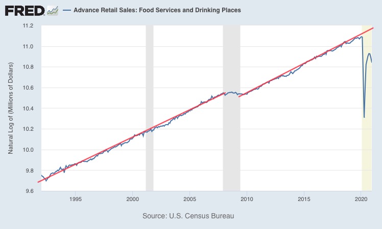
Unprecedented Restaurant Pain

The following chart shows the natural log of the sales of food services and drinking places. Constant exponential growth is seen as a straight line.


This is probably the most disturbing exponential trend failure that's ever been posted on this blog. The pandemic makes the Great Recession look like a minor hiccup. Will things ever return to normal? How many restaurants will actually survive?

Sunday, January 17, 2021

Long-Term Interest Rates: The Newer Normal?


This chart shows the natural log of the 30-year Treasury yield. On a log chart, constant exponential growth is seen as a straight line. In this case, the line is sloping down. That represents constant exponential decay. The half-life has been about 20 years, meaning it takes about 20 years for the 30-year Treasury’s interest rate to get cut in half.

From about 1987 on, there have been no failures to the top of the decaying channel. The Great Recession did cause a failure to the bottom of the decaying channel though. As seen in the chart, a “new normal” bottom appeared with the same slope as the original but offset to the downside. The Covid-19 recession caused an additional failure to the bottom of the decaying trend channel. Will this become a “newer normal” bottom? Will the top of the channel also fail to the downside this time? Would be nice to know.

I keep hearing some experts and pundits say the long-term trend of declining long-term interest rates is finally over. They seem to think long-term interest rates can only go up from here. Where’s the evidence? So far, the only failures to this trend have been to the downside. While I could easily see long-term rates reach the top of the trend channel again, I am not at all convinced that the overall long-term trend is anything but down.

When exponential growth trends fail to the downside, most agree that the trend is over. Up is no longer likely. Apparently, most do not agree when exponential decay trends fail to the downside though. For what it is worth, I still continue to believe that up is no longer likely over the long-term.

What could change my mind? Well, it’s simple. It needs to fail to the upside instead of the downside. That means the yield has to reach the top of the channel and then exceed it. We’re certainly a very long way from that!

This is probably one of the most important investment decisions one could make right now. Where are long-term interest rates ultimately headed? And when I say ultimately, I really mean within one’s lifetime. I don’t think anyone really expects the ultimate conclusion of all this debt to be favorable outside of one’s lifetime. What can’t go on forever, won’t. But there’s still the question of timing. Sigh.

Monday, May 11, 2020

Flattening the Curve


If industrial production in the United States was a disease, I’d say we’ve done a great job socially distancing ourselves from it since the Great Depression.

Source Data:
St. Louis Fed: Custom Chart

Thursday, May 7, 2020

Initial Claims


At this rate (-16.3% per week), it will take 7 more weeks before initial claims fall below a million. That’s 0.91 million on June 20th. And even then, initial claims will still be higher than the worst week of the Great Recession.

The good news or bad news is that this trend will fail at some point. But which way and how soon?

I’m not back to posting regularly. Everyone’s fine here (including our pets). And oddly enough, still have more than enough toilet paper. It’s one of the perks of long-term illusionary prosperity thinking, lol. Sigh.

Oh, and my retirement account is now sitting entirely in cash. Turns out that there wasn’t actually a TIPS bond bubble after all. Intended to hold to maturity but panicked investors and/or the Fed recently gave me a premium offer that I couldn’t refuse. Now patiently waiting for new opportunities to appear. No hurry. Like Warren Buffett apparently, I have never been this content in cash.

Source Data:
St. Louis Fed: Initial Claims

Thursday, July 7, 2016

Exponential Trend Failure of the Day: Mortgage Debt / Deposits

The following chart shows mortgage debt of households and nonprofit organizations divided by deposits at all commercial banks.


Click to enlarge.

Two wizards you can always trust:

1. Wizard of Wharton. Jeremy Siegel warned savers to not lock in long-term interest rates five years ago. Other than a massively growing deposit glut and plummeting interest rates since then, it was sound advice!
2. Wizard of Sarcasmia. If you send him $100, then he is legally obligated, under current galactic law, to send you one bag of authentic Spanish doubloons weighing no less than 87 troy ounces. Get you some!

Source Data:
St. Louis Fed: Custom Chart

Wednesday, June 15, 2016

Exponential Trend Failure of the Day: U.S. Industrial Chemical Production


Click to enlarge.

The U.S. chemical industry, a more than $800 billion enterprise, is heavily linked to the overall condition of the nation’s economy. It has been consistently leading the U.S. economy’s business cycle due to its early position in the supply chain. - Zacks Investment Research, May 20, 2016

June 15, 2016
The Business Insider: US industrial output fell in May; auto production plummets

The Federal Reserve said Wednesday that industrial output - which includes factories, mines and utilities - dropped 0.4 percent from April. The decline reversed the 0.6 percent gain seen between April and March, an improvement that provided some evidence that the industrial economy was turning around after a period of extremely weak performance.

Source Data:
St. Louis Fed: Industrial Production: Nondurable Manufacturing: Chemical

Wednesday, May 6, 2015

Time to Order Your Dow Million Hat!

Dow 100,000: Fact or Fiction

A seasoned investment strategist, Charles W. Kadlec has a startling answer: we are at an historic moment: the beginning of a Great Prosperity - a decade or more of above average economic growth. What lies ahead is a period of unparalleled opportunities for investors with a strategic outlook. In this provocative book, Kadlec reveals the forces driving this monumental boom and examines its potential impact. DOW 100,000 supports its supremely bullish premise: the DJIA is headed for a record 100,000 by the year 2020.

Great Prosperity!! You read it here first!!

"We know that it's possible because we have just lived through an equivalent tenfold increase in just the last 17 years." -- WIRED, 9/99

1982: 1,000
1999: 10,000
2016: 100,000
2033: 1,000,000

Don't be the last to order your Dow Million hat! There's only 18 years left to go!

Long-term strategic prosperity planning, baby. That's what I'm talking about. Short-term non-strategic investors will be hatless. Do not be one of them!

Tuesday, March 17, 2015

The Winter 'Pocalypse (Musical Tribute)

The following chart shows the number of new private single family housing units authorized by building permits.


Click to enlarge.

March 17, 2015
Housing Starts Plunge by the Most in Four Years

It was just the weather, basically,” said Richard Moody, chief economist at Regions Financial Corp. in Birmingham, Alabama. Still, “my view of the recovery in single-family housing is that it’s coming more gradually than others think.”


Source Data:
St. Louis Fed: Custom Chart

Tuesday, December 23, 2014

When Can We Expect a Complete Housing Recovery?

The following chart shows the 12-month moving total of new one family housing units sold per capita.


Click to enlarge.

Let's zoom in for a closer look.


Click to enlarge.

Due to the exponential trend failure, we can no longer expect a complete housing recovery in 2017. The new estimate is just this side of never.

Source Data:
St. Louis Fed: Custom Chart

Exponential Trend Failure of the Day: Long-Term Nominal Hourly Earnings Growth (Musical Tribute)

The following chart shows the average hourly earnings of private production and nonsupervisory employees. I have added an exponential trend in red.


Click to enlarge.

Note the trend failure.

The next chart shows the deviation of the hourly earnings from the long-term trend.


Click to enlarge.

Check out that recovery.

1. We're now more than 5% below the long-term trend.
2. The linear free fall continues.


Source Data:
St. Louis Fed: Average Hourly Earnings of Production and Nonsupervisory Employees: Total Private

Monday, December 15, 2014

Proof That ZIRP Leads to "Sure Thing" Hyperinflation

In unsustainable mining output! What did you think I meant? Dollars? Does this site look like ShadowStats to you? You can't be serious! I may be a permabear, but I'm not entirely crazy! Mwuhahaha!

The following chart shows the 12-month moving average of mining industrial output.


Click to enlarge.

Holy cow? What are we building ourselves? I sure hope it involves full scale copper replicas of the Great Pyramids! How cool would that be?

Note that before ZIRP, mining output was heading down, chaotic, and full of mystery.

No longer! We're permanently free of anything bad happening! This new exponential trend in red is as smooth and tender as a fine steak in an upscale restaurant! It will never fail to please! Tasty to the last delicious bite!

This Week on Mine Your Manners

If you have to ask how much a New York "stake" is going to cost you over the long run, then perhaps you can't afford it. For example, Silver Standard Resources lost another 15% today.

What Rich People Do: Finding your way around the steakhouse

You can ask for A1 in a high-class steakhouse, but it’s tantamount to saying “I hate America. And I’m in favor of incestuous gay marriage between Communists … at Disneyland.”

That's what I love about monetary policy! ZIRP isn't just a blunt tool. Its sauce makes a great surgical condiment! A1! Top notch! Targets only the mining industry! Any potential misallocation of capital only ends up there! That leaves the rest of our economy to thrive for all eternity!


In all seriousness, it is very difficult to solve deflationary debt and production overcapacity problems by borrowing extra money to increase production capacity. I know. More crazy talk.

See Also:
Poll: Is There a Sarcasm Bubble?
Parabolic Hyperinflation Theories Thwarted by Twisted Maize of Cornucopia Puns

Source Data:
St. Louis Fed: Industrial Production: Mining

Friday, December 12, 2014

Long-Term Dividend Growth (Musical Tribute)

The following chart shows the 1-year moving average of the natural log of real total corporate dividends (adjusted for inflation). When using natural logs, exponential growth can be seen as a straight line.


Click to enlarge.

I have good news, bad news, worse news, and more good news.

1. The good news is that we made it back into the red long-term trend channel.

2. The bad news is that the blue trend failed a year ago. It is what got us back into the red long-term trend channel.

3. The worse news is that the red long-term trend channel has now failed again as well.

4. And finally, the good news. Maybe nobody will notice or care.

Let's zoom in for a closer look.


Click to enlarge.


Source Data:
St. Louis Fed: Custom Chart