Wednesday, November 13, 2013

Misinformation Services

The following chart shows the 5 year moving average of the percentage of employees in information services who are not production and nonsupervisory employees. In other words, it basically shows how many supervisors there are.


Click to enlarge.

1. How are we going to get accurate propaganda in this environment? Anarchy!!

2. The higher paid propaganda jobs are vanishing before our very eyes! Why don't we hear more about this? What does this mean for college students expecting to get these jobs?

3. There's a black helicopter circling overhead. I don't think I'll be able to...

4. Please make a comment on our blog and include your full name and address. We are still who you think we are. Nothing to worry about. We are most certainly not highly compensated employees of the National Security Agency. Let us assure you of that. We just need to know where you live so we can deliver fresh tasty pizzas to you and your loved ones. We have so many fresh tasty pizzas. Oh, they smell so fresh and tasty. There are more than enough for everyone but we cannot guarantee their freshness if you do not respond immediately. It is just a small token of our appreciation for showing interest in the Illusion of Prosperity blog.

Source Data:
St. Louis Fed: Custom Chart

Tuesday, November 12, 2013

The Long-Term Inactivity Index


Click to enlarge.

A zero value for the index indicates that the national economy is expanding at its historical trend rate of growth; negative values indicate below-average growth; and positive values indicate above-average growth.

Source Data:
St. Louis Fed: Chicago Fed National Activity Index

Sunday, November 10, 2013

Moving Towards a Smarter Unemployment Force

The following chart shows the two year moving average of the percentage of the unemployed (25+ years of age) who have bachelor's degrees and higher.


Click to enlarge.

May 23, 2012
The Globalist: Moving Toward a Smarter World

I am optimistic — not because I expect human nature to change, but because we now have at our disposal an enormous new natural resource: the gusher of data that enables us to literally see and understand our world as never before.

The data certainly gushes. I'll give him that.

Source Data:
St. Louis Fed: Custom Chart

The Hollowing Out of America's Middle Class


Click to enlarge.

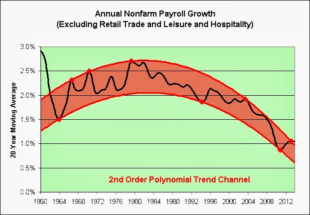
As seen in the chart above, retail trade, leisure, and hospitality production and nonsupervisory employment has been growing faster than employment overall. This is clearly not a recent development.


Click to enlarge.

Not only do these jobs not pay well, but in inflation adjusted terms they pay roughly one-third less than they did in the early 1970s.

The future's so bright I gotta wear lampshades.

Source Data:
BLS: Employment
St. Louis Fed: CPI

Saturday, November 9, 2013

The Jobs of the Future


Click to enlarge.

September 3, 2013
After a Recent Upswing, College Enrollment Declines, Census Bureau Reports

In 2012, there were 19.9 million college students, including 5.8 million enrolled in two-year colleges, 10.3 million in four-year colleges and 3.8 million in graduate school.

The math suggests that we are going to have some seriously well educated retail, leisure, and hospitality workers in the future.

Some people probably wonder why I'm still a permabear. Go figure.

Source Data:
St. Louis Fed: Custom Chart

Friday, November 8, 2013

College Graduate Unemployment


Click to enlarge.

You can disregard the blue point due to the government shutdown if you like. As for the trend in red, a good pair of rose-colored glasses will make it virtually invisible!

Source Data:
St. Louis Fed: Custom Chart

Employment Mass Extinction Events

Those not in the labor force have grown nearly 3.2 million over the past year, with nearly 1 million in just the past month.


Click to enlarge.

There was a major long-term trend shift starting in 2000. The Fed didn't like the old normal in red so it offered us up a housing bubble and in its aftermath a new normal in blue. It's a bit hard to tell the two normals apart in the chart. Well, you kind of can. The new normal is a bit steeper. It's probably trying to make up for lost can kicking ground. Oh the futility! Unintended consequences for the win!


Click to enlarge.

Note that the Great Recession also created a major long-term trend shift in those dropping out of the labor force permanently more than likely. One wonders if there will be more employment mass extinction events in the not too distant future. One especially wonders that if all this current can kicking is no more permanent than the last time.

Source Data:
St. Louis Fed: Not in Labor Force per Capita
St. Louis Fed: Real Social Security Benefits per Capita

Thursday, November 7, 2013

Hugging the Bottom Hair of the Dog That Bit Us

The following chart shows motor vehicle loans as a percentage of annual wage and salary accruals.


Click to enlarge.

How much debt is too much? We'll find out someday if we keep hugging the bottom of that trend channel.

October 28, 2013
More new-car buyers opt for 7-year loans

More new-car buyers are stretching out their loan payments as long as possible — as many as seven years — and experts wonder if the trend is another financial time bomb.

Source Data:
FRB: Historical Motor Vehicle Loans
St. Louis Fed: Compensation of Employees: Wages & Salary Accruals