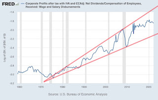
The following chart shows the natural log of the dividends to wages ratio. When using natural logs, constant exponential growth is seen as a straight line. I have added two trend lines in red (one for the peaks and one for the troughs).
The two trend lines can be traced back to where they meet. The year was roughly 1971. Doubt it's a coincidence. I'm tempted to say that falling off of the gold standard is when the illusion of long-term prosperity truly began. Kind of makes me feel like a prosperity chart archeologist.
As disturbing as that is, I'm not done yet. Note that:
1. Bad things often happen when we move towards the troughs.
2. We've been moving towards a trough lately.
3. Very bad things have been happening lately.
4. Should we ultimately reach the next trough, there's still a very long way to go.
Real Estate Newsletter Articles this Week
-
At the Calculated Risk Real Estate Newsletter this week:
[image: ICE Home Price Index]*Click on graph for larger image.*
• 2nd Look at Local Housing Market...
16 hours ago


