Monday, January 13, 2014

Real Interest on Government Debt per Capita

When Will Interest on US National Debt Exceed $1 Trillion? - Mish

As a holder of long-term government debt, I have three different questions in mind.


Click to enlarge.

1. When can we expect to break free from the long-term trend channel?
2. When can we expect ZIRP to permanently end?
3. Of all the things I could worry about in this economy, where should the risk of rising interest rates (and expense) rank on my list?

My answers of "not soon", "not soon", and "low" may differ from yours of course. I'll be much more worried when the majority agrees with my answers. And when do I expect that to happen? Not soon.

This is not investment advice.

Source Data:
Treasury Direct: Interest Expense on the Debt Outstanding
St. Louis Fed: CPI
St. Louis Fed: Population

Sunday, January 12, 2014

The Cone of Employment Pain

The following chart shows the annual job growth using the quarterly average of the equally weighted government establishment and household employment surveys. I'm using the quarterly average to filter the noise out a bit.


Click to enlarge.

Perhaps an optimist can find something good in that chart, but I certainly can't (at least over the long-term and/or full business cycle anyway).

May 18, 2012
Recession Prediction

They say that predicting the next recession is a fool's game. Well, sign me up. Why not!

I'm going to predict the next recession will hit on or before October 2014.

For what it is worth, the odds of me turning optimistic any time soon are somewhere between slim and none. Just so you know, slim left town. Put another way, I see little reason to change my long-standing prediction.

This is not investment advice. Predicting the future is a fool's game. That said, it might be even more foolish to ignore the risks entirely. It's certainly easy and popular these days though. I'll give you that.

January 6, 2014
Hussman Funds: Confidence Abounds

Confidence abounds. Last week, Investor’s Intelligence reported a surge in advisory sentiment to the highest bullish percentage since October 19, 2007. The National Association of Active Investment Managers (NAAIM) reported that the 3-week average equity exposure among its members increased to the highest level on record.

Hey, what do you know? No sarcasm this time, unless sheer unadulterated long-term employment chart terror counts. I don't think it does but it is certainly open for debate.

See Also:
The Overleveraged Cone of Shame

Source Data:
St. Louis Fed: Custom Chart

Saturday, January 11, 2014

New Record: Restaurant Employees per Capita


Click to enlarge.

As of November of 2013, 3.28% of our population works in the food services and drinking places industry. That's a new record. Can't ever have too many highly compensated restaurant workers in this brave new world!

As clearly seen in the chart (red trend line), it will only grow exponentially higher from here. Just look at that 0.990 correlation!

What's that blue line you say? Oh, that's an old trend that you need not concern yourself with all that much. With a lower correlation of just 0.988 it was surely doomed to fail at some point. And what a pathetic growth rate it had. That 1.78% annual growth rate pales in comparison to the new and improved 2.42%.

And to think, all we needed to get here was a Great Recession to speed things along. It's only a matter of time before every man, woman, and child in America will be flipping burgers for a living! Hurray! What could possibly go wrong?

Motherboard: Meet the Robot That Makes 360 Gourmet Burgers Per Hour

Yeah, robots are taking our jobs, and it’s not a question of if, but when and how. Economists often treat the service industry as some last bastion of downsize-proof labor, but, clearly, robots will make sandwiches and take orders, too.

A future where we can get gourmet burgers, cheaply and on the quick, sounds pretty nice. But that future will also have structural unemployment, unless we start taking major strides to rethink and reform how we work in a world where robots are doing much of the heavy lifting.

Source Data:
St. Louis Fed: Custom Chart

Craziest Monetary God Dam Design Ever!

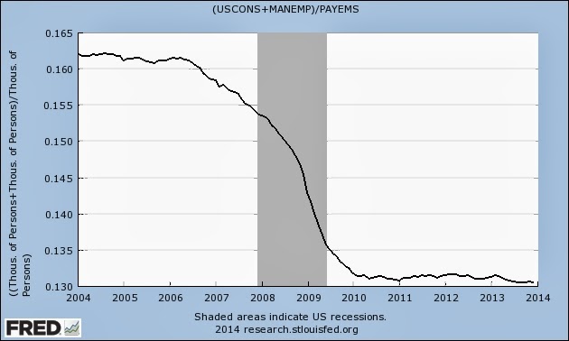
The following chart shows construction and manufacturing payrolls as a fraction of nonfarm payrolls.


Click to enlarge.

That sure looks like a fish ladder to me. The only difference is that the fish aren't supposed to be heading downstream. Down 19% and temporarily holding!

Fish Ladder

The velocity of water falling over the steps has to be great enough to attract the fish to the ladder, but it cannot be so great that it washes fish back downstream or exhausts them to the point of inability to continue their journey upriver.

Oh oh. Sounds like a faulty dam. What went wrong?


Click to enlarge.

Craziest monetary god dam design ever! That's what! Who in their right mind would put the monetary floodgate below the fish ladder?


I said in the past that some posts are mostly for the puns. How could I pass up this post's title once it got stuck in my head? Hahaha! Sigh. I sigh because the data is ugly, especially over the long-term. Gallows humor can't fix that.

See Also:
The "Recovery"

Source Data:
St. Louis Fed: Custom Chart
St. Louis Fed: Monetary Base

Friday, January 10, 2014

Real Nonfinancial Corporate Business Equity per Capita


Click to enlarge.

The $60,000 is patiently waiting there for you to retire again (as of September of 2013). I'm glad we finally got that all worked out. Other than returning to the $21,600 median again someday, what's the worst that could possibly happen?

I mean seriously. As long as nobody panics and attempts to cash out that $60,000 per capita to fuel a retirement, then stocks have probably reached a permanently high plateau. Oh yeah, that's a plateau all right. Don't let the nattering nabobs of negativism convince you that it is the third spike higher of three (since the late 1990s). That's just crazy talk.

What are the odds that those with the most stock market exposure (soon to be retirees) will be the ones to cash some of those stocks out? Makes no sense at all unless retirees, for some unknown and irrational reason, suddenly decide to embrace less risk once they quit their jobs (as I have done). And why would they buy low and sell high when everyone knows for a fact that stocks only go up again? Do they just want to lose money make less money?

Irving Fisher

Fisher was perhaps the first celebrity economist, but his reputation during his lifetime was irreparably harmed by his public statements, just prior to the Wall Street Crash of 1929, claiming that the stock market had reached "a permanently high plateau."

This is not investment advice. I don't claim to know the future with any level of certainty, which is a far cry from what we're continually told by the guests on CNBC. Expert after expert tells us that stocks are the only place to be and that long-term interest rates can only go up from here. Maybe. Maybe not. In any event, call me extremely skeptical.

Source Data:
St. Louis Fed: Custom Chart

Some Children Left Behind

The following chart shows the number of child day care services employees.


Click to enlarge.

That's some recovery we've got there. It's strong and resilient. Yes, sir.

In my opinion, the Japanese should have patented massive economic busts and ongoing zero interest rate policies as effective birth control medicines. Just think of the royalties!

April 17, 2013
Japan's population suffers biggest fall in history

Japan's rapidly ageing population has suffered its biggest decrease since records began in the 1950s, according to new figures.

January 8, 2014
CDC: U.S. Fertility Rate Hits Record Low for 2nd Straight Year; 40.7% of Babies Born to Unmarried Women

The U.S. fertility rate has dropped from year-to-year for each of the last five years. In 2007, it was 69.3. In 2008, it was 68.1. In 2009, it was 66.2. In 2010, it was 64.1. In 2011, it was 63.2. And, in 2012, it was 63.0.

Source Data:
BLS: Employment

The Slippery Slope of Hope(lessness)

The following chart shows personal current transfer receipts divided by government current receipts.


Click to enlarge.

On Basilisk Station (David Weber, Copyright © 1994)

"Oh, that’s a wonderful idea!" Frankel snarled. "Those BLS increases are all that’s keeping the mob in check! They supported the wars to support their standard of living, and if we don’t—"

No worries! That quote comes from a book of science fiction. All governments appearing in this work are fictitious. I'm sure that any resemblance to real governments is purely coincidental.

Check out the last three data points at the trough of the long-term channel.

2000:Q1: Good times!
2007:Q2: Better times!
2013:Q2: Best times!

Other than 2000 and 2007, perhaps there has never been a better time to swing for the fences? The stock market only goes up again! What could possibly go wrong? It is possible that the 2013:Q2 data point isn't the actual bottom. I can say this though. First, we bounced off of it. Second, if I exclude the 2013:Q2 data point (which I have tested) then the channel changes insignificantly. Put another way, that's where the channel seems to want to go anyway.

This is not investment advice. It's a chart, some possibly meaningless trend lines, and a potential warning. No crystal ball here. I'm just trying to point out a risk that you won't hear on CNBC. That said, it is a risk that I'm not willing to embrace. I've been "risk off" since 2004 and intend to stay that way permanently. In hindsight, I have no complaints so far.

On Basilisk Station is a favorite book of mine. It is free to download on the Kindle. The second book, Honor of the Queen, is also free to download. I received a Kindle for Christmas. I have no idea how I ever lived without it (especially now that my comfortable reading distance isn't what it once was). The Kindle is one reason I have been posting a bit less lately. (Another reason is that I'm also working very diligently on my New Year's resolution.)

I know what you must be thinking. Free is fine and dandy but how much is it going to cost to download a complete collection of H.P. Lovecraft (my favorite author)? 99 cents. Infinitely more expensive! Right? Just keep telling yourself that the cost per word isn't all that hyperinflationary. That's how I'm planning to do it once I get over the sticker shock anyway. Don't forget to factor in the savings from not driving to the mall to pick it up. That helps too (perhaps not so much for mall employees, but that's a story for a different post).

What an odd economy we have. I've often said that the best things in life are free or nearly free (once basic necessities are covered anyway). Free and/or 99 cents certainly qualifies.

Source Data:
St. Louis Fed: Custom Chart

Wednesday, January 8, 2014

The Overleveraged Cone of Shame

The following chart shows the natural log of the 1-year treasury yield. By using a natural log, constant exponential growth (or more importantly in this case, exponential decay) can be seen as a straight line.


Click to enlarge.

We're repeatedly told to brace for the rising interest rate environment. It's a sure thing! Coming any decade to a country near you! I assume that the advice is intended for the long-term, and not just some short-term unsustainable cyclical bounce. I therefore offer a two-step program to get us there.

Steps Needed

1. Get back in the cone!


2. Escape from the cone (to the upside)!


File:Kelpie wearing an Elizabethan collar.jpg (aussiegall from sydney, Australia)

How hard can it be? Do not concern yourself that we aren't making any progress towards completing the first step. The second step is bound to be easier. Once the cone goes on, how hard can it be to get the cone off and run free? There I go, thinking as a dog again. Always the optimist!

The future's so bright I gotta get coned! Yes! Genius!

As a side note, you'll be happy to know that the dog in the photo made a full recovery. I just wish the same could be said for our economy.

Once again, this is not investment advice. I'm simply suggesting that some sure things are not quite as sure as many seem to believe (whether it be getting in cones or escaping from them). But what's new?

Source Data:
St. Louis Fed: Custom Chart